Let’s see how to perform Correspondence Analysis with R. (You can download the data set from Blackboard as biscuit.csv). We first start by loading the datasets in our environment together with the libraries.
The \(p\)-value is exceptionally small! We can then expect CA to give us significant results.
library(FactoMineR)res <-CA(dat[,-1])
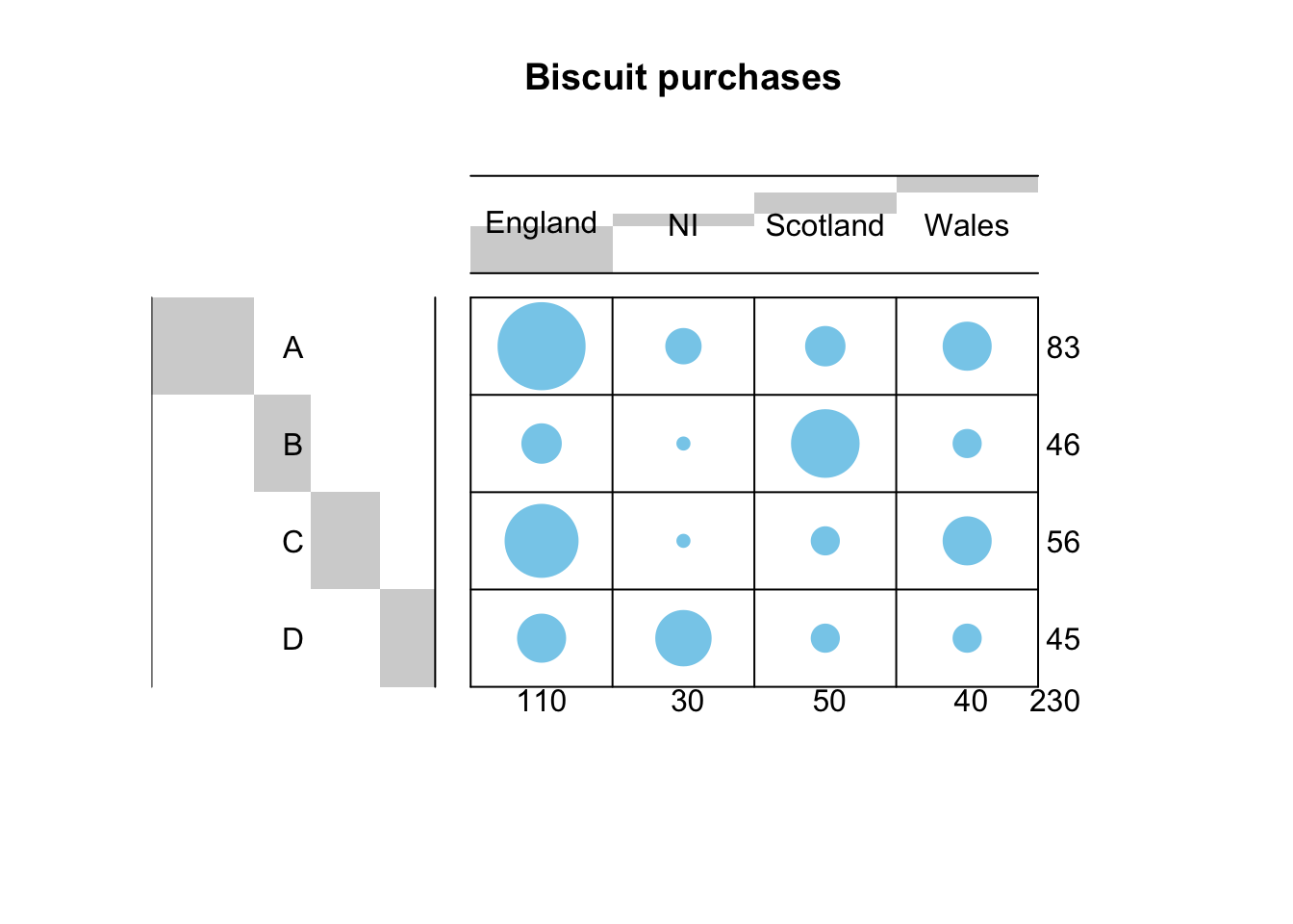
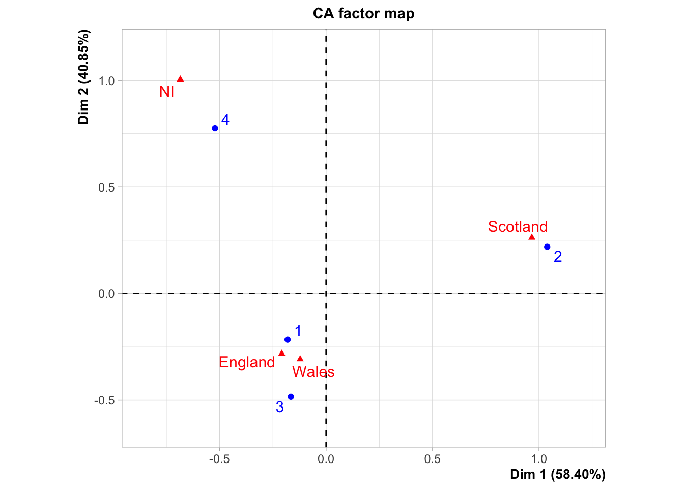
We see a very strong association between categories: Brands 1 and 3 are big favourites in England and Wales; Brand 2 in Scotland and Brand 4 in Northern Ireland.
res$row
$coord
       Dim 1      Dim 2        Dim 3
1 -0.1809579 -0.2156873 -0.072909726
2  1.0385758  0.2195956  0.005666833
3 -0.1654913 -0.4838897  0.082995013
4 -0.5219437  0.7755216  0.025402494

$contrib
      Dim 1     Dim 2      Dim 3
1  4.110045  8.347489 51.4555087
2 75.032226  4.795499  0.1722747
3  2.319275 28.347159 44.9857399
4 18.538454 58.509852  3.3864767

$cos2
      Dim 1      Dim 2        Dim 3
1 0.3871453 0.55000695 6.284779e-02
2 0.9571793 0.04279217 2.849691e-05
3 0.1020300 0.87230855 2.566146e-02
4 0.3115196 0.68774249 7.378886e-04

$inertia
[1] 0.03052328 0.22537879 0.06535561 0.17109867
Based on this analysis, the retail company can optimize their sales of this item.
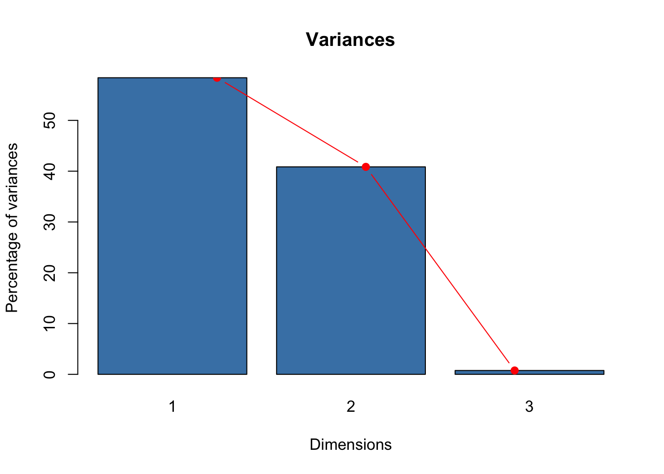
How good is this plot? Are two dimensions effective to explain the association? We can check this using our good old friend, the proportion of variance explained by the first two dimensions.
res$eig
       eigenvalue percentage of variance cumulative percentage of variance
dim 1 0.287513686             58.3954461                          58.39545
dim 2 0.201114547             40.8473553                          99.24280
dim 3 0.003728115              0.7571985                         100.00000
pr.var <-t(res$eig[,2])barplot(pr.var, names.arg=1:3, main ="Variances",xlab ="Dimensions",ylab ="Percentage of variances",col ="steelblue")lines(x =1:3, pr.var, type="b", pch=19, col ="red")
The first two dimension explain more than 99% of the variance: the analysis is then very accurate and reliable. We’ll see more on this in the CA Workshop.