plot(x=economics$date,y=economics$psavert, xlab='Date',ylab='Personal Savings Rate', ty='l')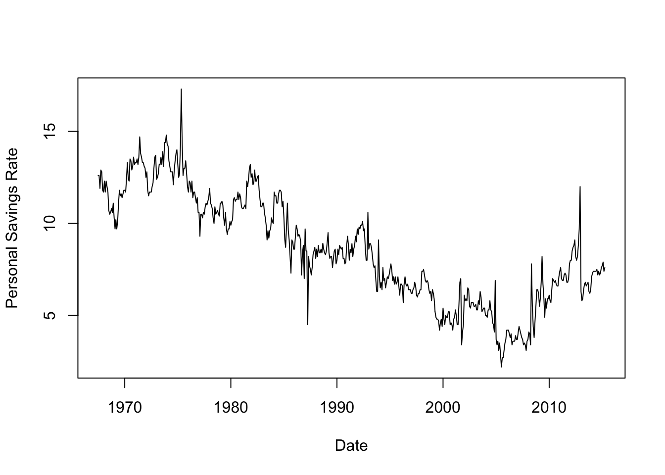
In this workshop, we will produce some high quality visualisations of time series.
By the end of the workshop, you will have seen how to:
loess
R’s built-in time series decomposition function (stl) to extract time series components where appropriate
A graph can be a powerful vehicle for displaying change over time. A time series is a set of quantitative values obtained at successive time points, and time series are most commonly graphed as a simple line graph with time horizontally and the variable being measured shown vertically. Let us have a glance at how to plot time series effectively with an example.
Download data: economics
The economics data set above contains monthly economic data for the USA collected from January 1967 to January 2015. The variables are:
date - month of data collectionpce - personal consumption expenditures, in billions of dollarspop - total population, in thousandspsavert - personal savings rateuempmed - median duration of unemployment, in weeksunemploy - number of unemployed in thousandsThe date column is stored in R’s Date format so we can plot it directly. However, this isn’t guaranteed of all data sets and sometimes you will need to convert it (see the as.Date function for how to do so). Thankfully, everything is all set up, so let’s plot the personal savings rate over time:
plot(x=economics$date,y=economics$psavert, xlab='Date',ylab='Personal Savings Rate', ty='l')
Time series of financial variables like these are very often quite noisy and variable. While there is obviously a general global trend, where the line between ‘trend’ and ‘noise’ is drawn is debatable and there is no single clear answer for these data. Fitting a smoother would help us identify a clear smooth trend, but using different levels of smoothing will give us quite different results.
## fit the model, note we have to convert our 'date' to numbers here
lfit <- loess(psavert~as.numeric(date), data=economics)
xs <- seq(min(as.numeric(economics$date)), max(as.numeric(economics$date)), length=200)
lpred <- predict(lfit, data.frame(date=xs), se = TRUE)
## redraw the plot
plot(x=economics$date,y=economics$psavert, xlab='Date',ylab='Personal Savings Rate', ty='l')
lines(x=xs, y=lpred$fit, col='red',lwd=4) 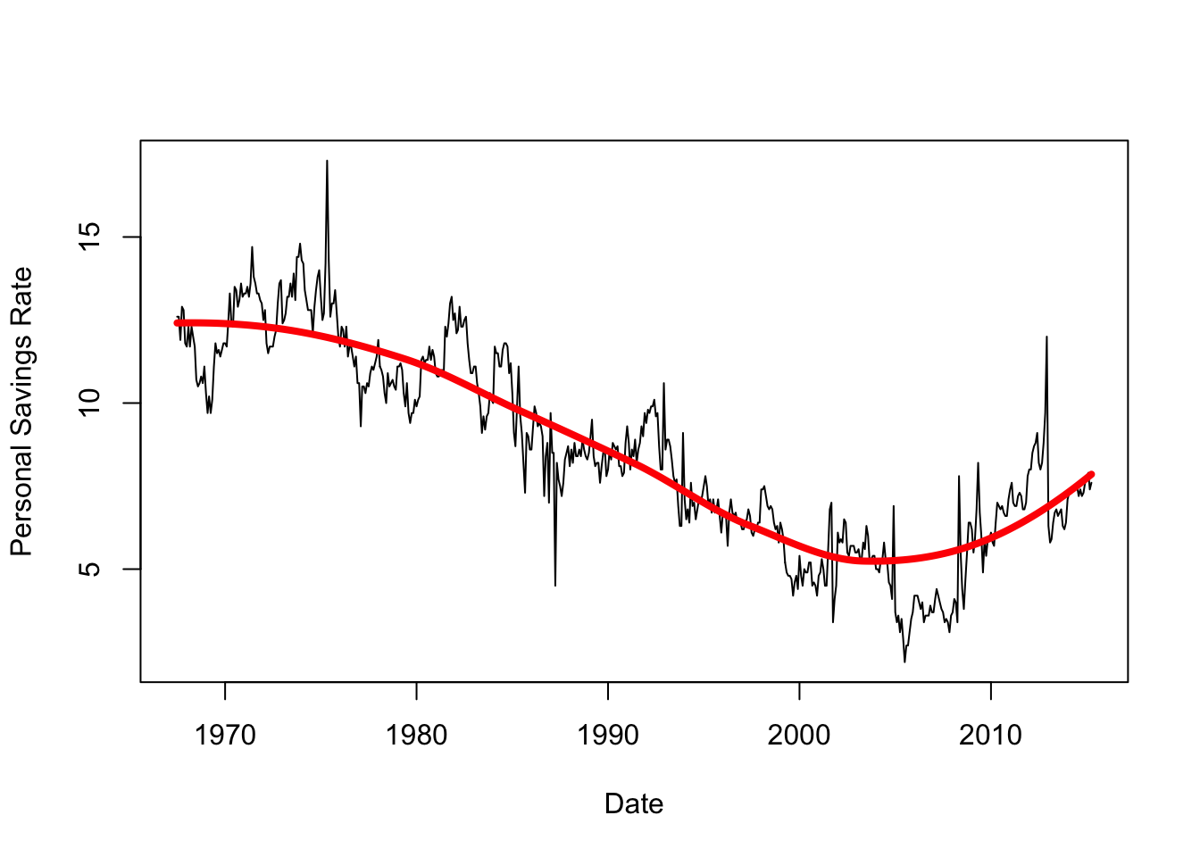
This extracts the overall trend quite cleanly! Note that we can easily customise the width and type of the smoothing curve
## fit the model, note we have to convert our 'date' to numbers here
lfit <- loess(psavert~as.numeric(date), data=economics)
xs <- seq(min(as.numeric(economics$date)), max(as.numeric(economics$date)), length=200)
lpred <- predict(lfit, data.frame(date=xs), se = TRUE)
## redraw the plot
plot(x=economics$date,y=economics$psavert, xlab='Date',ylab='Personal Savings Rate', ty='l')
lines(x=xs, y=lpred$fit, col='red',lwd=1.5, lty=3) 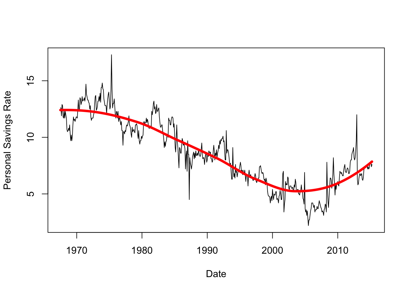
If we shrink the span, we will fit more closely to the lesser peaks in the data - but is this signal or just noise?
## reduce span to get a more localised fit
lfit2 <- loess(psavert~as.numeric(date), data=economics,span=0.1)
lpred2 <- predict(lfit2, data.frame(date=xs), se = TRUE)
## redraw the plot
plot(x=economics$date,y=economics$psavert, xlab='Date',ylab='Personal Savings Rate', ty='l')
lines(x=xs, y=lpred$fit, col='red',lwd=4)
lines(x=xs, y=lpred2$fit, col='green',lwd=4) 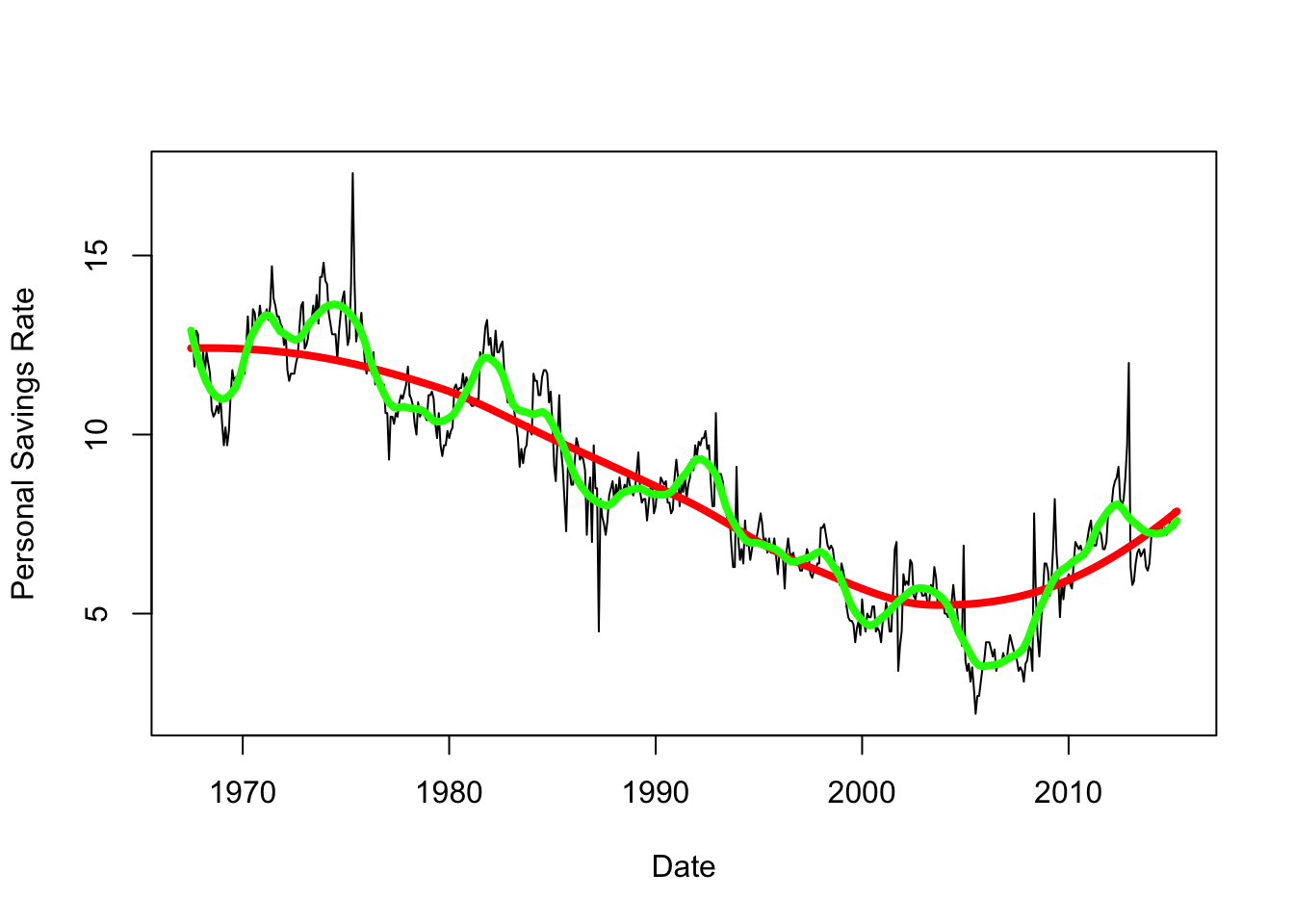
The variation around the trend is quite irregular here, and unless we have any other information to help us explain these features they are difficult to explain. We’ll return to this idea of breaking down a time series into different scales of detail later on.
Let us apply the above to another time series, exploring the evolution of income equality over time.
Download data: income
The income data set contains the mean annual income in the USA from 1913 to 2014. The values are given for two separate groups: the top 1% of earners (U01), and the lower 90% of earners (L90). This gives us two time series to explore - the main questions of interest is how have these time series changed relative to each other, and who has done better over the past 100 years? (though we can probably guess the answer).
par(mfrow=c(2,1))
plot(y=income$L90,x=income$year,ty='l')
plot(y=income$U01,x=income$year,ty='l')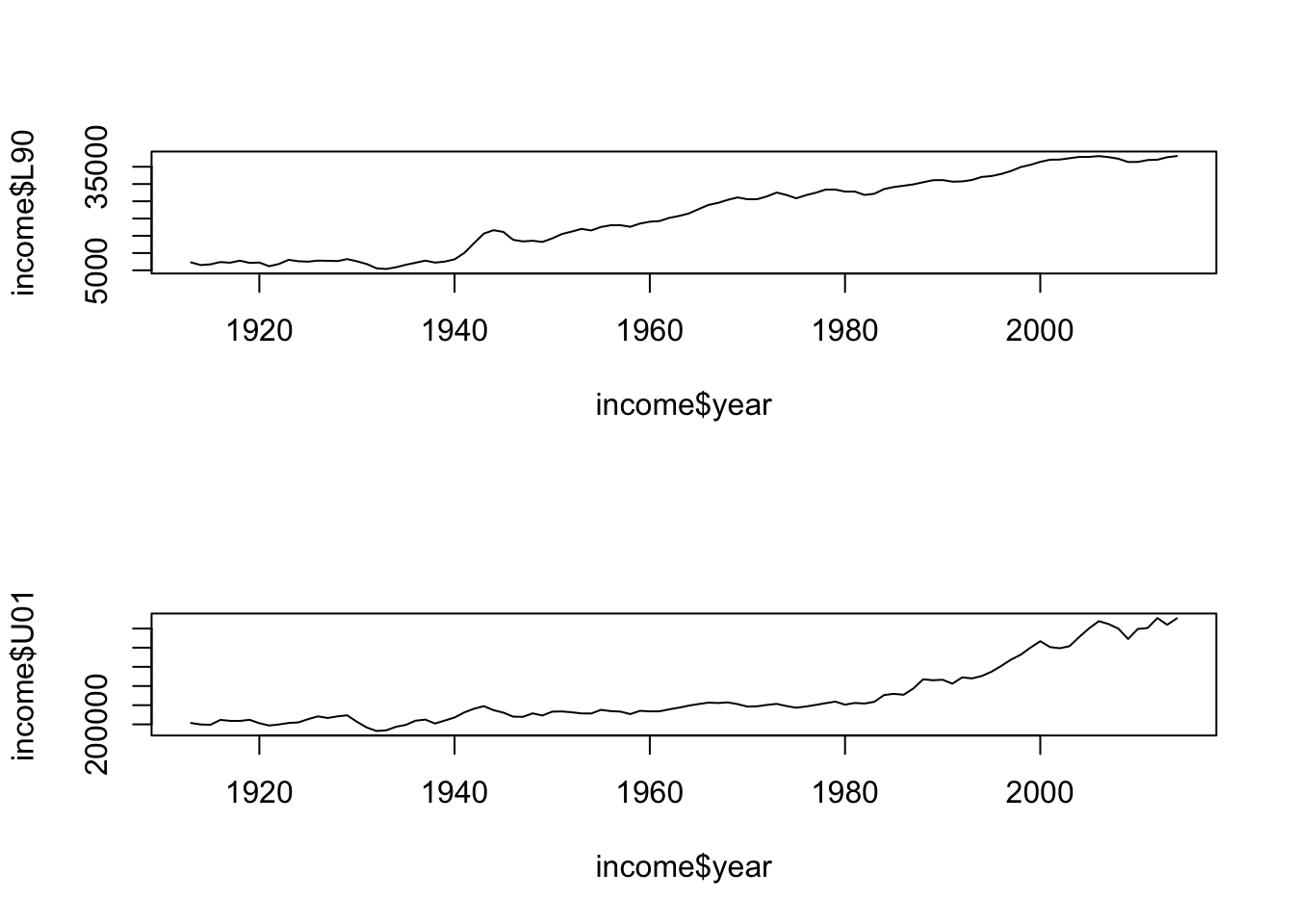
L90 values are a lot smaller, unsurprisingly; L90 appears flat until 1940, then starts to grow steadily, perhaps levelling out after 2010. U01 is also fairly flat until the 40s then slowly increases, and increases more rapidly after 1980
plot(y=income$U01,x=income$year,ty='l', ylim=c(min(income$L90),max(income$U01)))
lines(y=income$L90,x=income$year,col='red')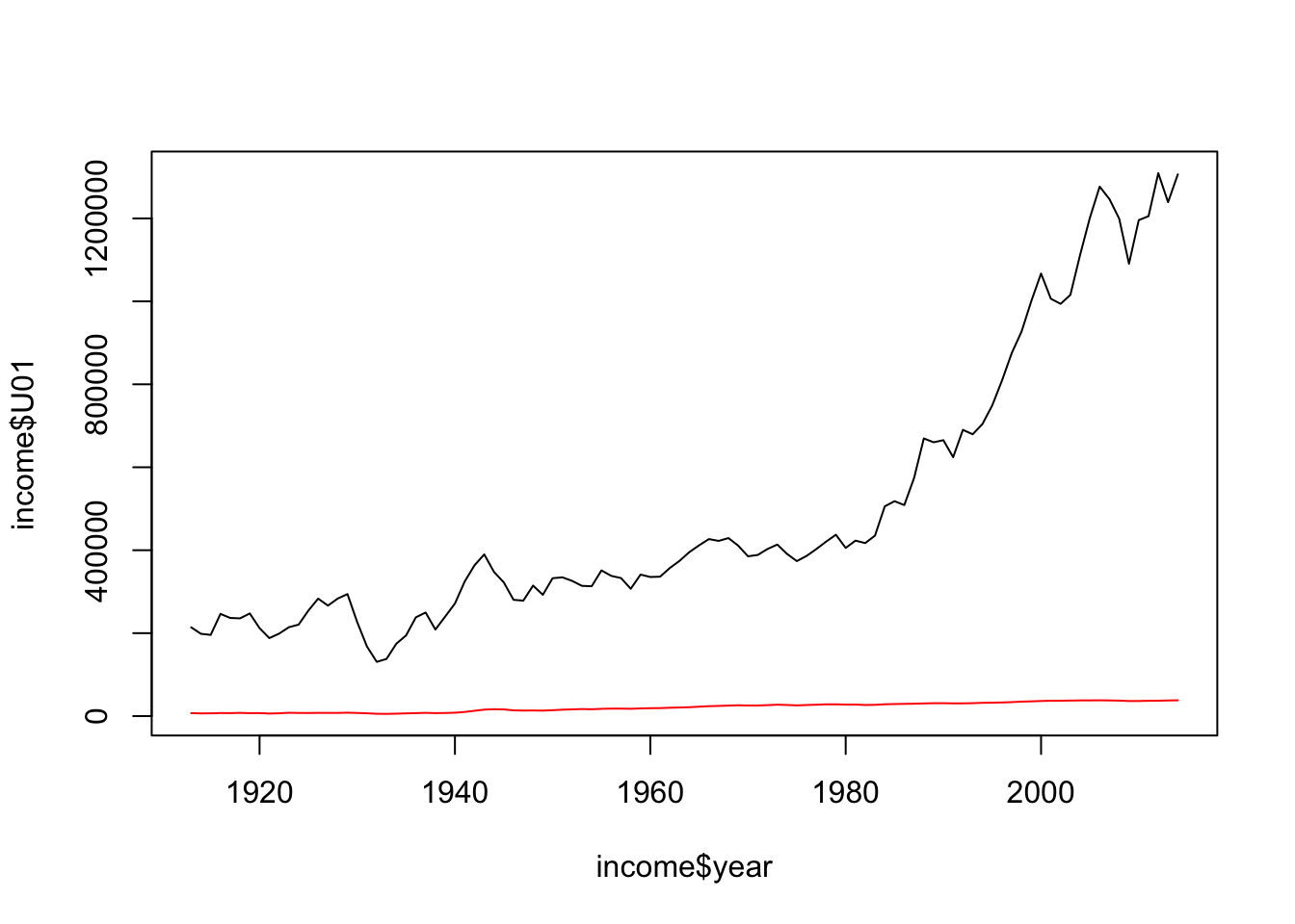
L90 becomes almost flat due to huge differences in scale!
A common problem when series have very different scales is that the variation of the larger series obscures anything going on in the other. A standard approach to this is to set a time point as a baseline (often the first point), and then calculate and plot the relative changes from that baseline value. If we take our first year as baseline, then we can have a scale-free measure of growth to compare.
The plot of the standardised data can be obtained with the following code:
income$L90rel <- 100*(income$L90/income$L90[1]-1)
income$U01rel <- 100*(income$U01/income$U01[1]-1)
plot(y=income$U01rel, x=income$year,ty='l')
lines(y=income$L90rel, x=income$year,ty='l',col='red')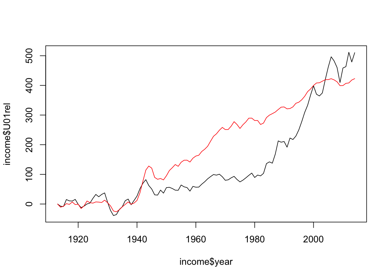
Here we see the growth relative to the 1913 levels more clearly: both groups changed similarly up to mid 1940s (end of WWI), after this point the income of L90 grew more rapidly until the 1980s, where the U01 income increased dramatically and by the early 2000s the U01 group had income growth larger than the L90 (despite starting from a higher baseline!)
When we have two associated time series, it can be interesting to see how they vary jointly over time. For this we can use a form of scatterplot. However, given the dependence of both variables on time it is importance to connect the points so we can see where the series is coming from and heading to.
L90 and U01, and draw a scatterplot with L90 vertically against U01 horizontally. Use plot type ty='b' (b for ‘both’) to connect your points with lines. What features do you see?text (type ?text) for details. text(x=income$U01,y=income$L90, labels=income$year, cex=0.5, pos=4)cut function here to split a numerical variable up into a categorical factor.groups <- cut(income$year, breaks=c(1900,1936,1960,1983,2020),
labels=c())
plot(x=income$U01, y=income$L90, ty='b',pch=16, col=groups)
text(x=income$U01,y=income$L90, labels=income$year, cex=0.5, pos=4, col=(1:4)[groups])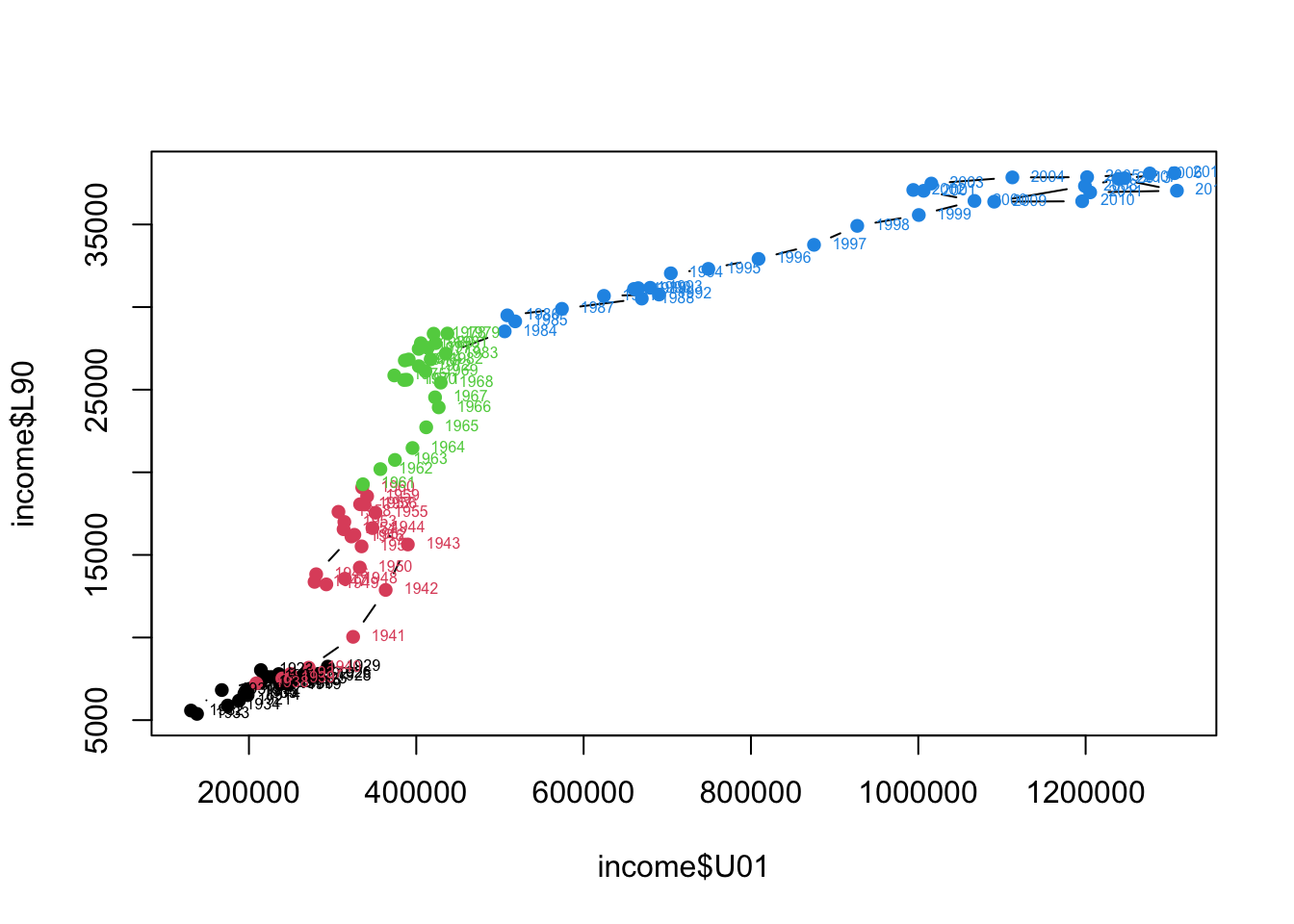
Income for both groups struggles to grow much until the 30s, income growth stalls for all following WW2, and takes until the 60s to recover. L90 income grows steadily until the 70s, after which it grows much more slowly and the U01’s income grows substantially in the 80s/90s. Another stutter in income affects mostly the U01 in the 2000/2010s (financial crisis).
In theory, it should be possible for incomes to rise for everyone at the same time — for the gains of economic growth to be broadly distributed year after year. But the takeaway from these graphs is that since World War II, that’s never really happened in the U.S.
Note that the analysis of multiple time series is a huge topic of its own: here we are just scratching the surface, but if you are interested to learn more about this I can point you to some references.
When exploring a time series, we often notice that it follows a general trend (given by its smoothing), it often has a periodic, or seasonal, behaviour, and then there is some residual noise that might be a little or a lot, depending on the time series.
Let us see an example using a famous data set.
Download data: co2
The co2 data contains the average monthly concentrations of CO2 from 1959 recorded at the Mauna Loa observatory in Hawaii. Environmental time series like this one often have a very strong and regular pattern to them.
plot(y=co2$co2,x=co2$decimaldate,ty='l')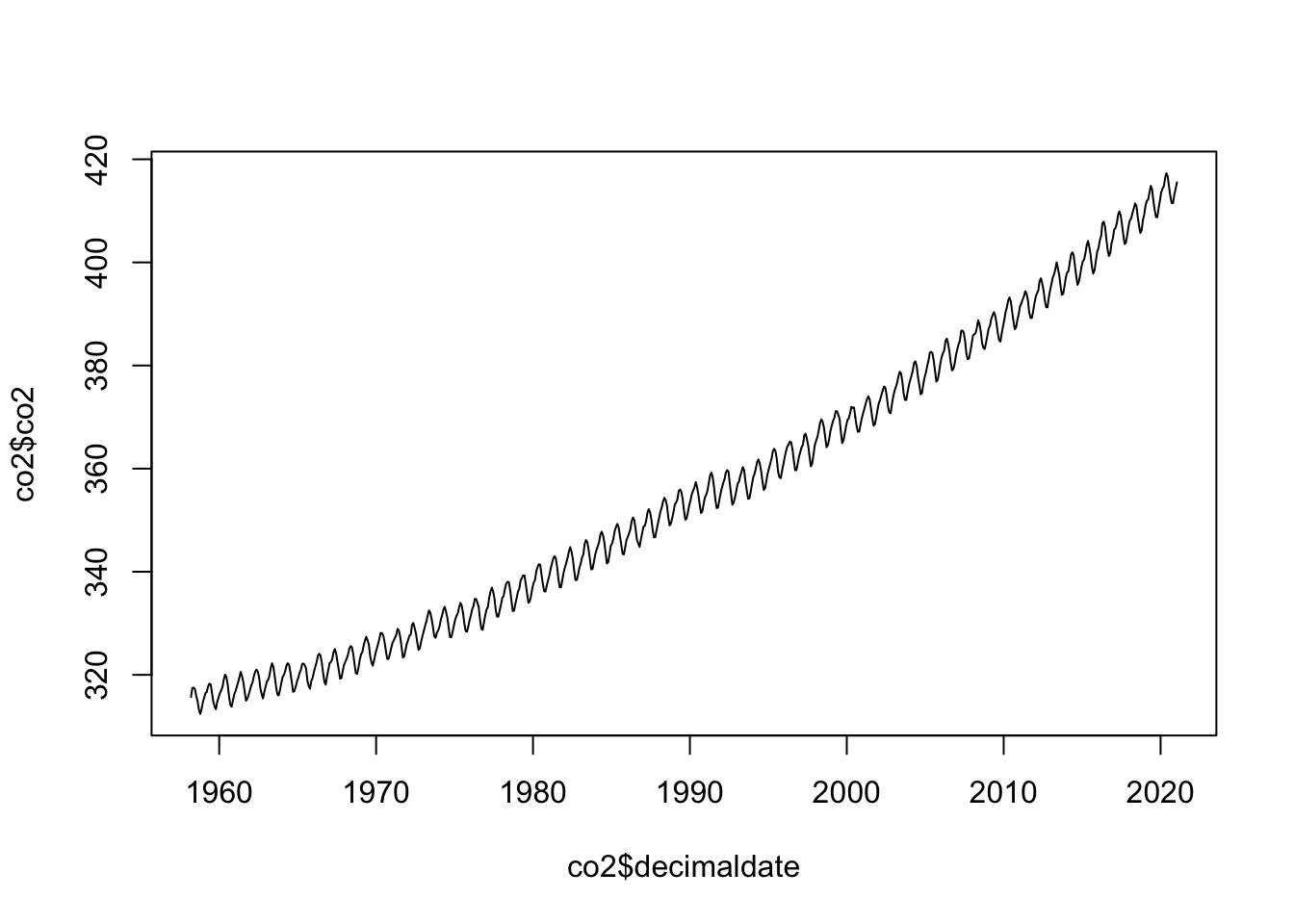
There’s a clear trend here, with a regular wiggle around it
plot(y=co2$co2,x=co2$decimaldate,ty='l', xlim=c(2010,2020))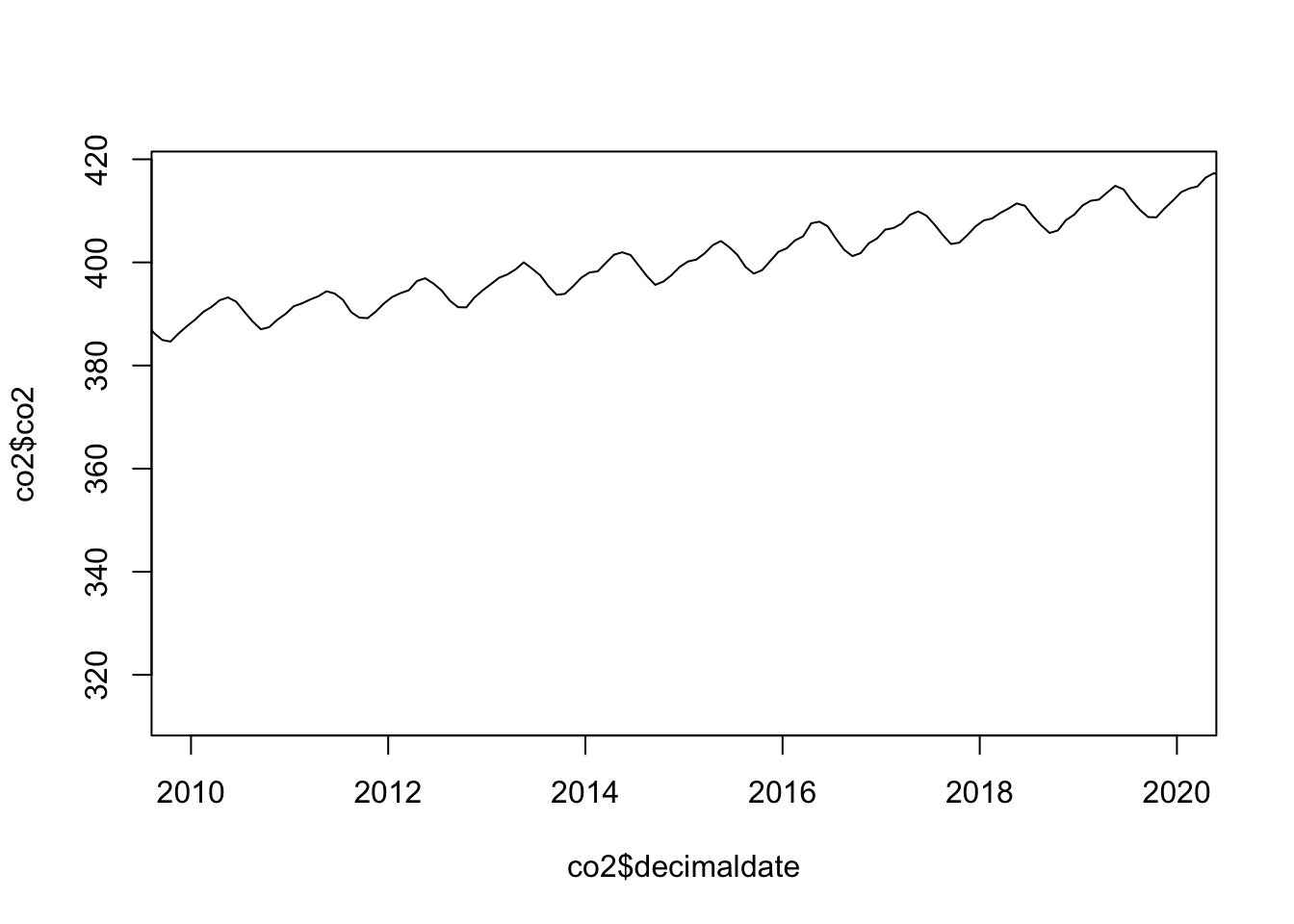
the wiggle seems to repeat every year, peaking in summer and falling in winter.
For time series with a strong seasonal component it can be useful to look at a Seasonal Decomposition of Time Series by Loess, or STL. Essentially, we define a regular time series such as this in terms of three components:
To do a time series decomposition, we’ll need to turn the data into a ts (time series) object so it is recognised by R.
co2ts <- ts(data = co2$co2,
          start = co2[1, 1:2],
          end = co2[nrow(co2), 1:2],
          frequency = 12)
Then we can apply the time series decomposition
decomp <- stl(co2ts, s.window = "periodic")and plot the results:
plot(decomp, col = 'blue')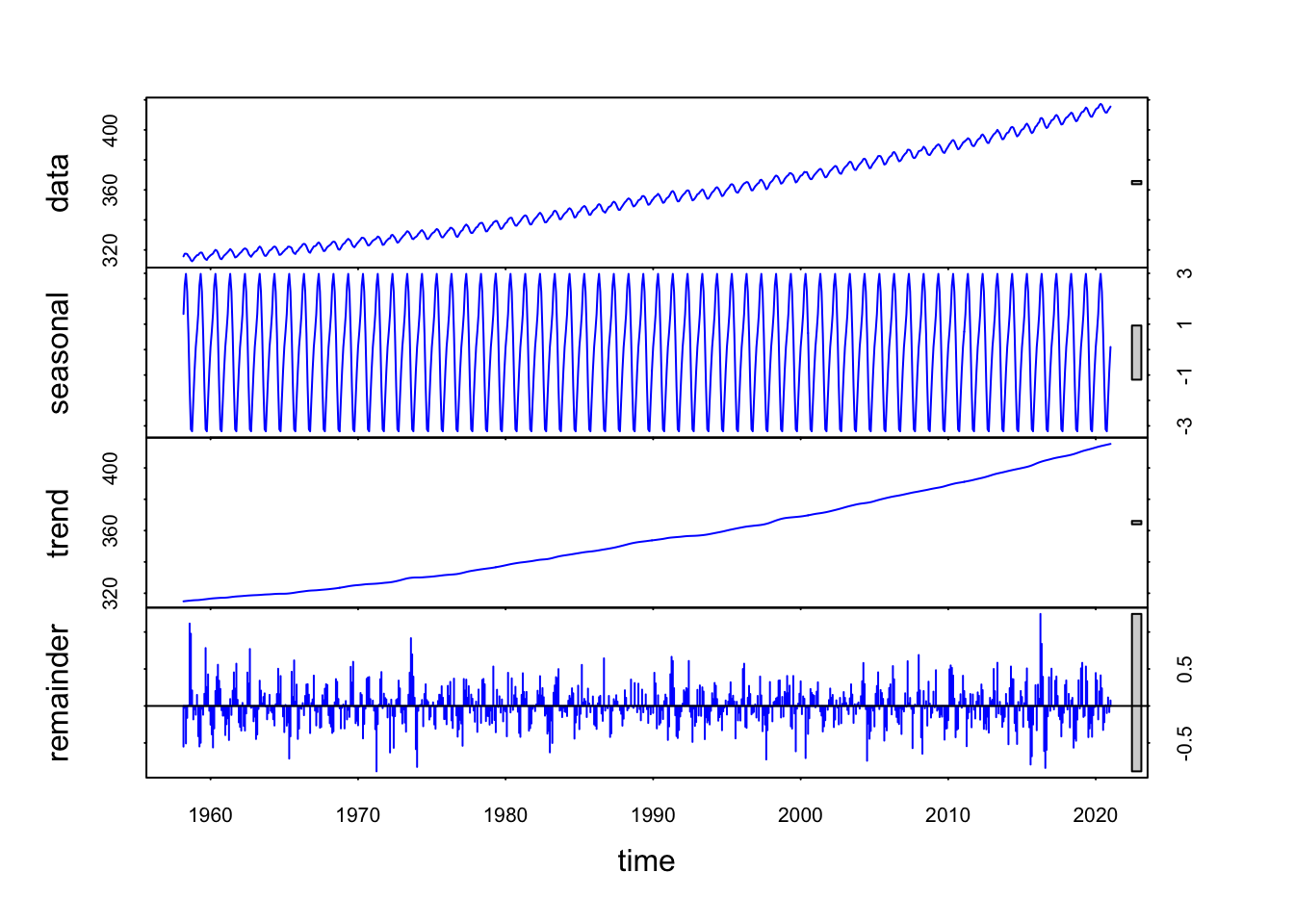
The top panel gives the original data, the second panel gives the estimated regular periodic effect around the overall trend, the third panel shows the overall trend and the final panel shows the residuals (as data - trend - seasonal). The residuals are quite small, suggesting this decomposition describes the data well.
To visualise the time series and the trend in the same plot, we can run the following code:
plot(y=co2$co2,x=co2$decimaldate,ty='l')
## draw a red line for the trend
lines(y=decomp$time.series[,2],x=co2$decimaldate,col='red')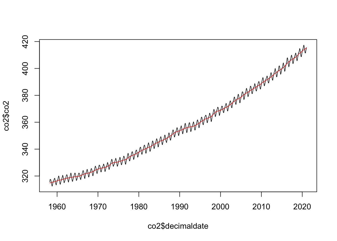
We can also add a blue line with the trend plus seasonal component, to check if this is a good fit for the whole time series.
plot(y=co2$co2,x=co2$decimaldate,ty='l', xlim=c(2010,2020)) ## use x-axis limits to zoom in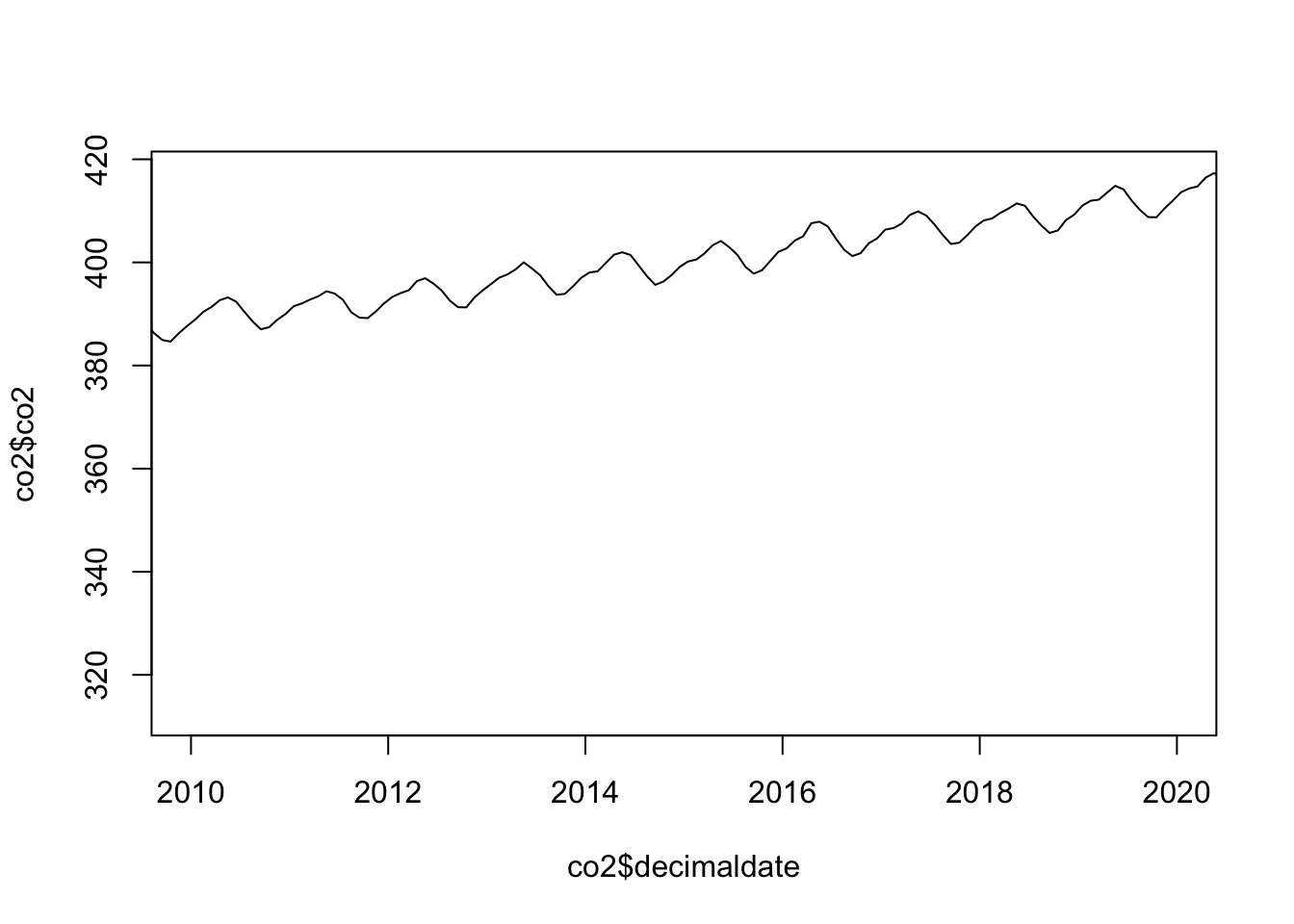
plot(y=co2$co2,x=co2$decimaldate,ty='l', xlim=c(2010,2020), ylim=c(380,420))
lines(y=decomp$time.series[,2],x=co2$decimaldate,col='red')
lines(y=decomp$time.series[,1]+decomp$time.series[,2],
      x=co2$decimaldate,col='blue')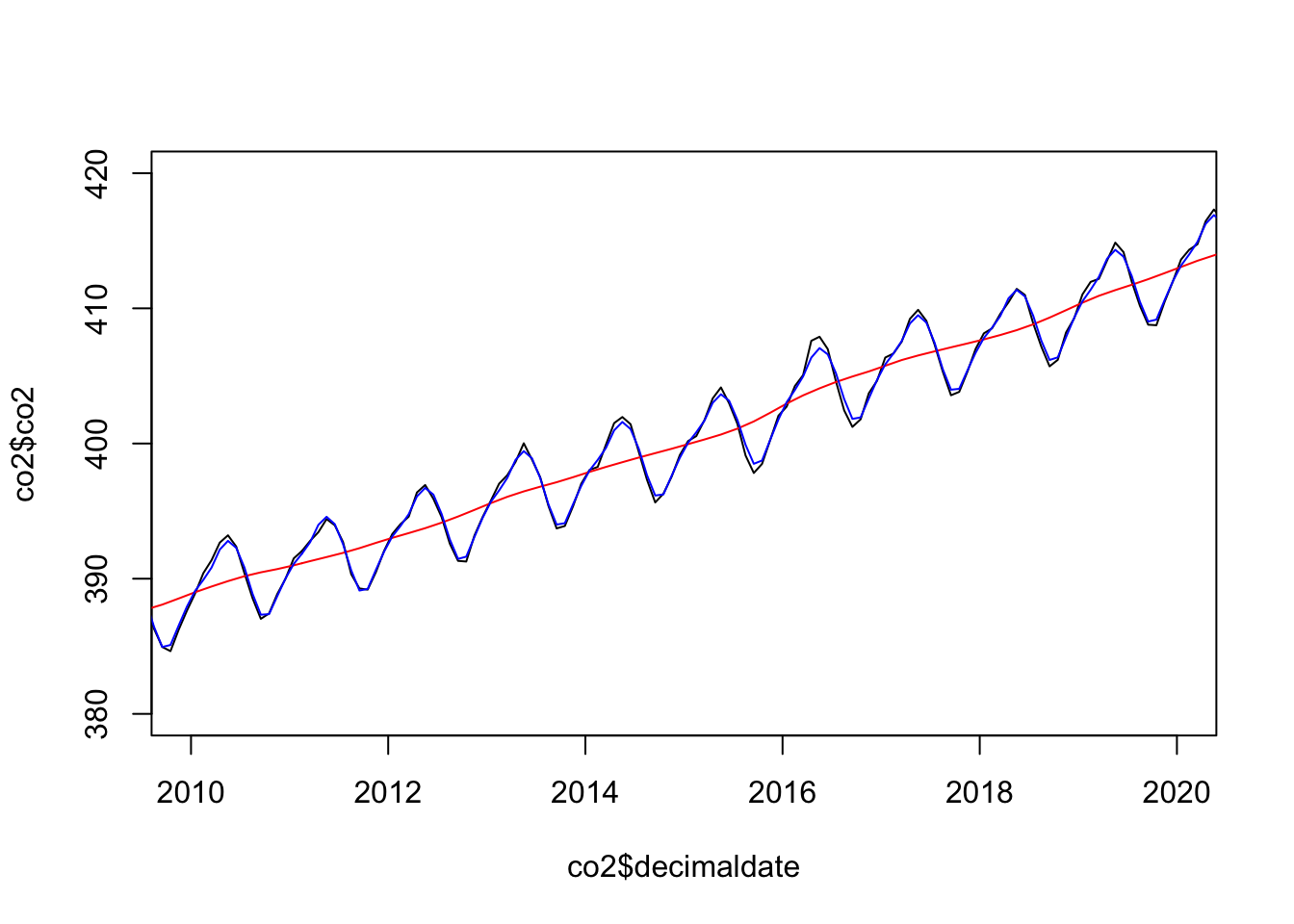
We see some imperfections, but overall this looks good! Decomposing seasonal time series like this can be very effective, however it can be difficult to find such ideally-suited time series with such regular behaviour outside of highly-structured situations.
In lectures, we saw that there are different kinds of multiple time series, and that visualisation methods for comparing them depend on their nature:
It is always a good idea to compare not only the full plots of these time series, but also their decomposition. In fact, there is a high chance of spurious correlations when it comes to comparisons between time series!
Let’s see an example: in the economics data set, look at the two variables:
pce - personal consumption expenditures, in billions of dollarspop - total population, in thousandsTheir corresponding time series, plotted together, look like this
par(cex=0.85,cex.axis=0.85,cex.lab=0.85)
plot(x=economics$date,y=economics$pce, ty='l',col="red",lwd=2,xlab='',ylab='', ylim=c(min(economics$pce),max(economics$pop)))
lines(x=economics$date,y=economics$pop, ty='l',col="green",lwd=2,xlab='',ylab='')
legend(x='topleft',col=2:5,lwd=2,pch=NA,legend=c('Consumption','Population'))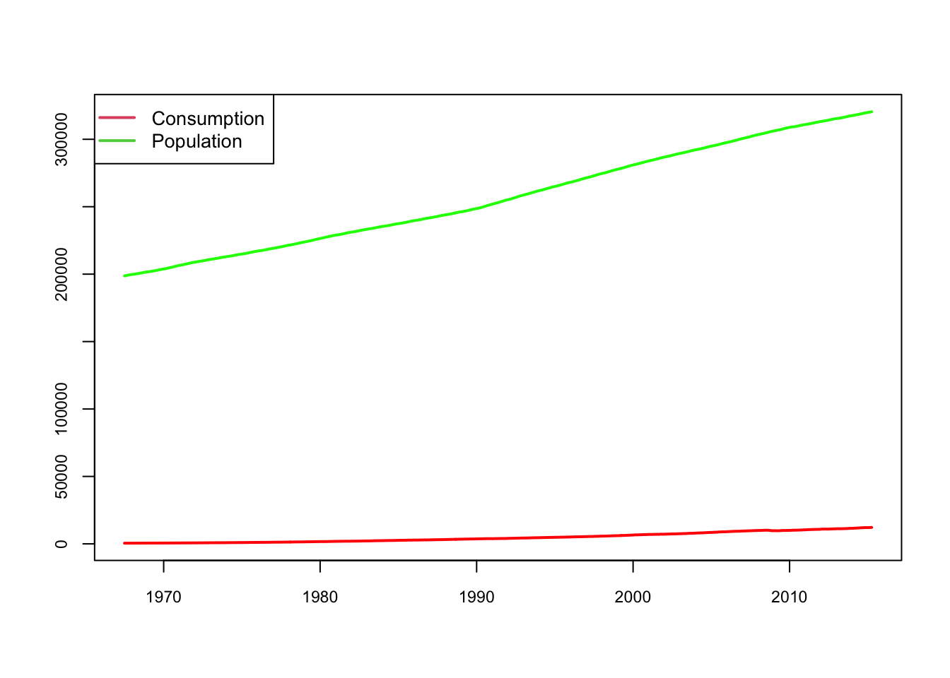
Of course, this plot is a bad visualisation for many reasons: the units are different, the scale is different, and one series flatten the other so badly that we can barely notice the increasing trend of pce. In order to meaningfully compare the two time series, let us standardise the two variables:
pop_z <- scale(economics$pop)
pce_z <- scale(economics$pce)
and re-plot the time series:
x <- economics$date
ylim <- range(c(pop_z, pce_z), na.rm = TRUE)

plot(x, pop_z, type = "l", ylim = ylim, ylab = "z-score", col="green")
lines(x, pce_z, col = "red")
legend(x='topleft',col=2:3,lwd=2,pch=NA,legend=c('Consumption','Population'))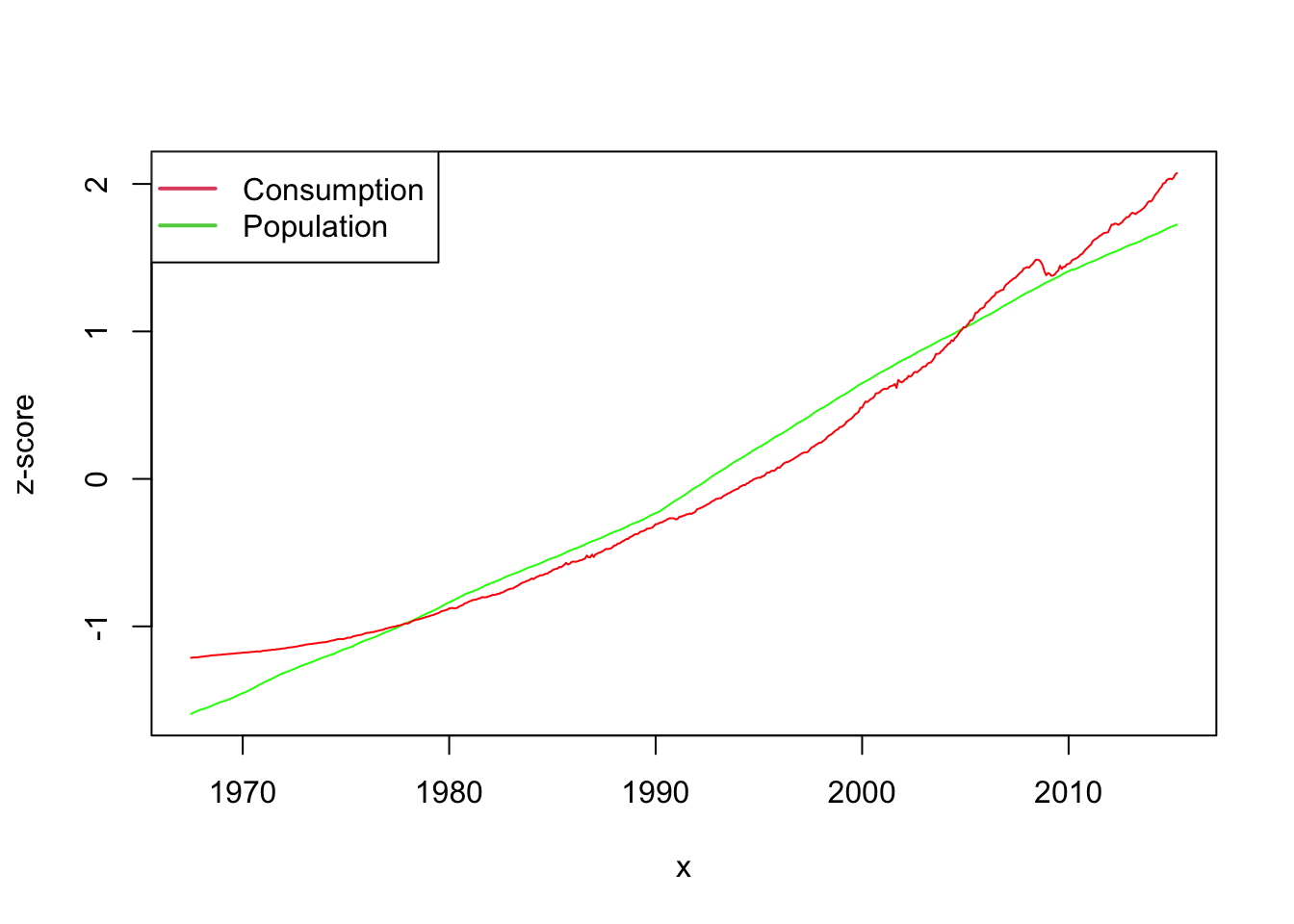
We now see that both variables have a strong upward drift, but not quite in the same way. Now, if we compute the correlation of pop versus pce, we get
cor(economics$pop, economics$pce)[1] 0.9872421so, population and consumption are almost perfectly correlated! However, it is important to understand why it is so: does the very high correlation result from the fact that one variable influences the other or only from the fact that both variables grow over time? In order to establish this, we need to compare the correlation of the different components of the time series.
economics$pop and one for the time series of economics$pce.economics$pop and economics$pceHere is the code for the STL decomposition
pop_ts <- ts(as.numeric(scale(economics$pop)), frequency = 12)
pce_ts <- ts(as.numeric(scale(economics$pce)), frequency = 12)

pop_decomp <- stl(pop_ts, s.window = "periodic")
pce_decomp <- stl(pce_ts, s.window = "periodic")
Here is the plot of trends
plot(y=pop_decomp$time.series[,2], x=economics$date, ty='l', col="green")
lines(y=pce_decomp$time.series[,2], x=economics$date, col="red")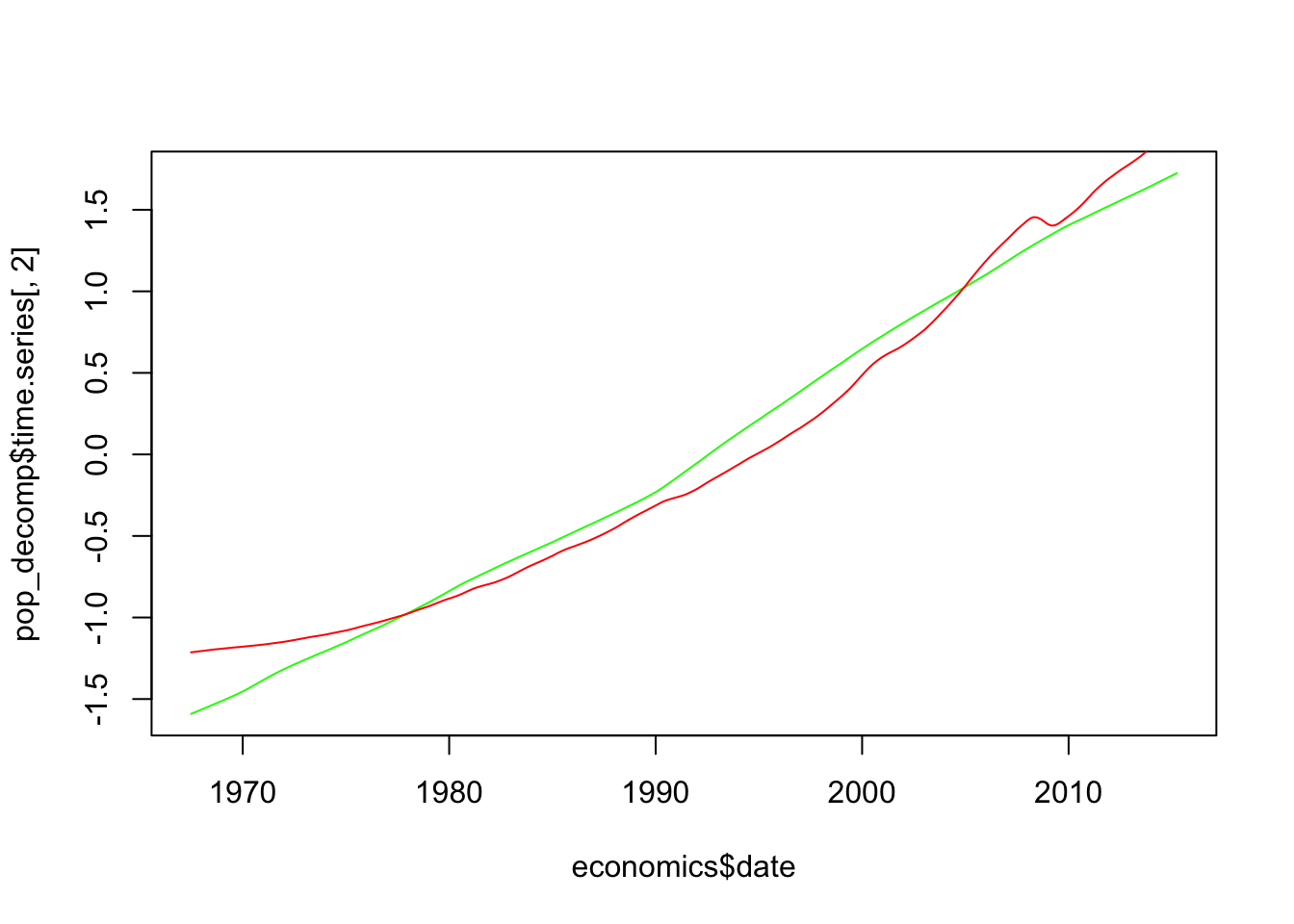
Here is the plot of seasonal components. Since this is periodic, it makes sense to look at this over a limited period of time
plot(y=pop_decomp$time.series[,1], x=economics$date, ty='l', col="green", xlim=c(1,1000))
lines(y=pce_decomp$time.series[,1], x=economics$date, col="red")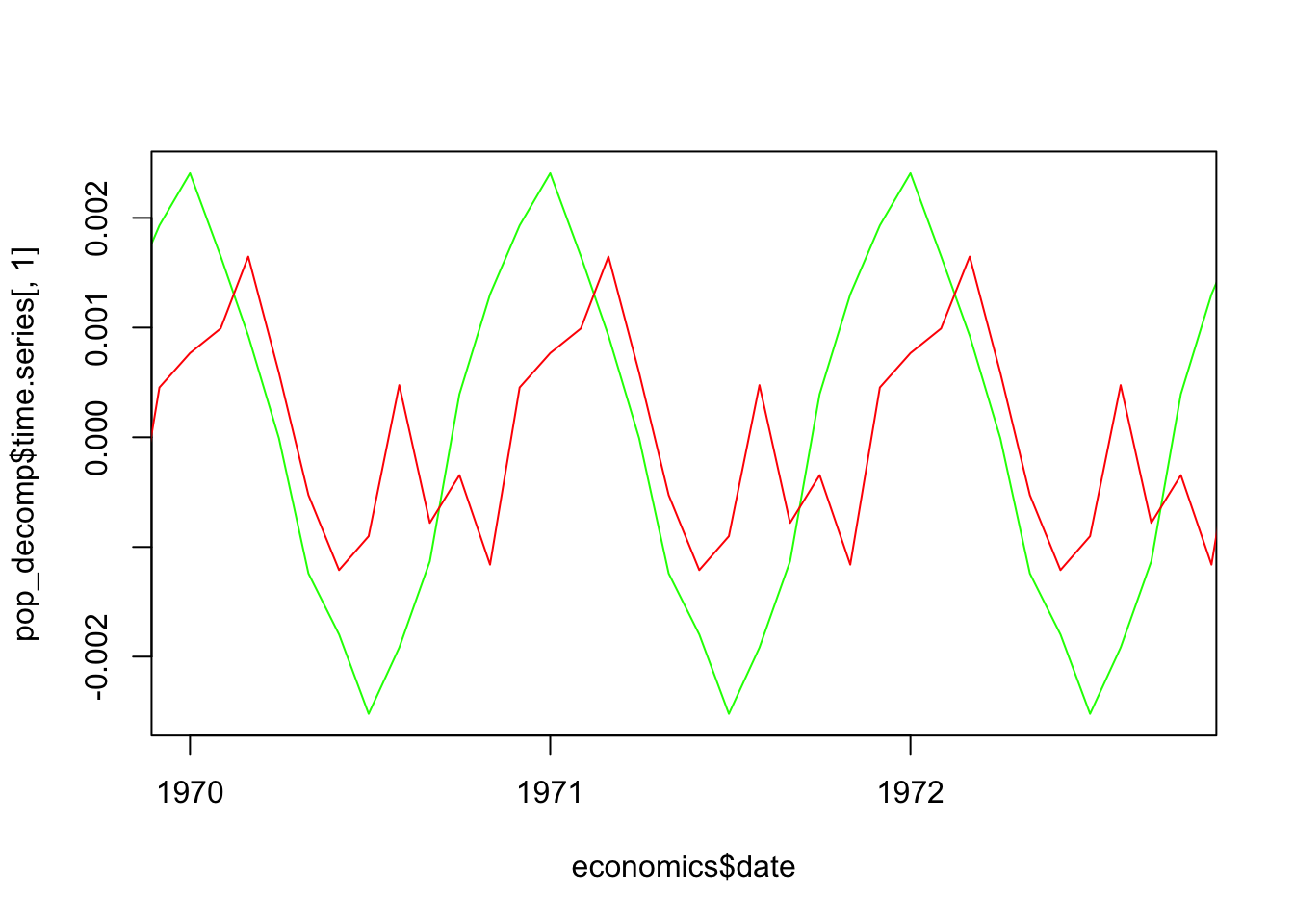
There is a bit of lagged correlation, but an essentially different seasonal pattern.
The plot of residuals is better done as a scatterplot:
plot(y=pop_decomp$time.series[,3], x=pce_decomp$time.series[,3], ty='p', col="blue", pch=16)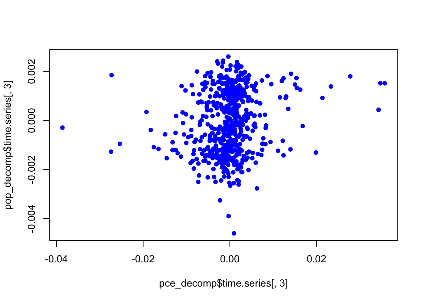
This shows no association of residuals. In summary, almost all the correlation between the two time series is induced by time. We can only conclude that both variables have a constant increasing trend with time, and that’s why they are correlated. In other words, this is a spurious correlation.
As a sanity check, let us compute the correlation coefficient of the components.
cor(x=pop_decomp$time.series[,1], y=pce_decomp$time.series[,1])[1] 0.5350119cor(x=pop_decomp$time.series[,2], y=pce_decomp$time.series[,2])[1] 0.9873021cor(x=pop_decomp$time.series[,3], y=pce_decomp$time.series[,3])[1] 0.1676072