install.packages("vcd")Practical 2 - Exploring Many Categorical Variables with R
Introduction
This practical will lead you into producing some high quality visualisations of multivariate categorical data.
By the end of the lab, you will have acquired the following skills:
- Plotting stacked barplots for simple data sets
-
Plotting
doubledeckerandmosaicplotplots for more complex data sets
You will need to install the following packages:
vcdfor thedoubledeckerfunctions. You also need to load the corresponding library in your environment.
library(vcd)Loading required package: gridExercise 1 (Mosaicplots)
Displaying combinations of categorical variables can be quite difficult, as we can’t represent our data as simple points in a space. Instead, we summarise a categorical variable (e.g. eye colour) with multiple levels (blue, green, brown, …) by the frequencies of each of the levels in the data. When we have multiple categorical variables, we work instead with the counts of the combinations of the levels (e.g. red hair + green eyes).
All of our plots are some sort of visualisation of these counts and so are (in one way or another) variations and manipulations of stacked barplots. Multivariate categorical data is a little more complex to work with, so generally it is recommended to start with single or pairs of variables and progressively add more, rather than visualising everything all at once like a scatterplot matrix.
Download data: arthritis
The arthritis data contains the results from a double-blind clinical trial investigating a new treatment for rheumatoid arthritis. The variables are:
ID- patient ID.Treatment- factor indicating treatment (Placebo, Treated).Sex- factor indicating sex (Female, Male).Age- age of patient.Improved- ordered factor indicating treatment outcome (None, Some, Marked).
Treatment, Sex, and Improved are all categorical variables. Improved is also ordinal, since the category levels can be ordered. The question is whether the patient improvement depends on the Treatment and Sex.
Mosaic plots can display the relationship between categorical variables using rectangular tiles, whose areas represent the proportion of cases for any given combination of levels. A mosaic plot of a single variable is basically a simple stacked barplot with only one bar. Looking at the patient improvement only, we see the following
mosaicplot(~Improved, data=arthritis,col=2:4,main='')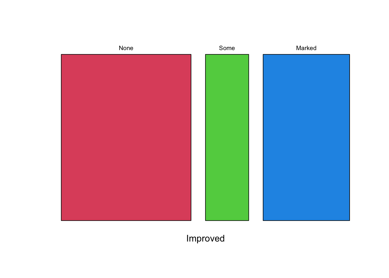
Since the None box is largest, we see that this appears to be the most common patient outcome. But taking the Some and Marked improvements together, it’s actually an even split. Let’s see how this depends on what Treatment the patient received - we would hope to see more improvement from those in the Treated group:
mosaicplot(~Treatment+Improved, data=arthritis,col=2:4,main='')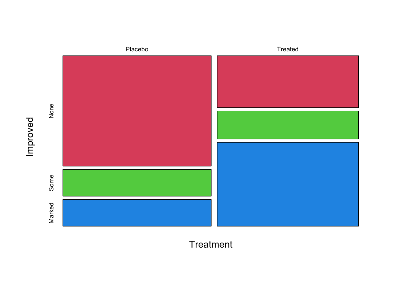
Note that the plot now has two splits: the first split is horizontal into bars for the “Treated” and “Placebo” groups, while the second set of splits divides each bar up into the different Improved categories. If Treatment had no effect on the Improved state, then we would see a regular grid where the two sets of bars would have splits of approximately the same size and we could draw lines from the left of the plot to the right without cutting through any of the tiles.
However, we can see clearly that a greater proportion of patients improved on treatment than in the placebo group and so the distribution of Improved is different for different values of Treatment, which may point towards an association between these variables and maybe hints at treatment being effective!
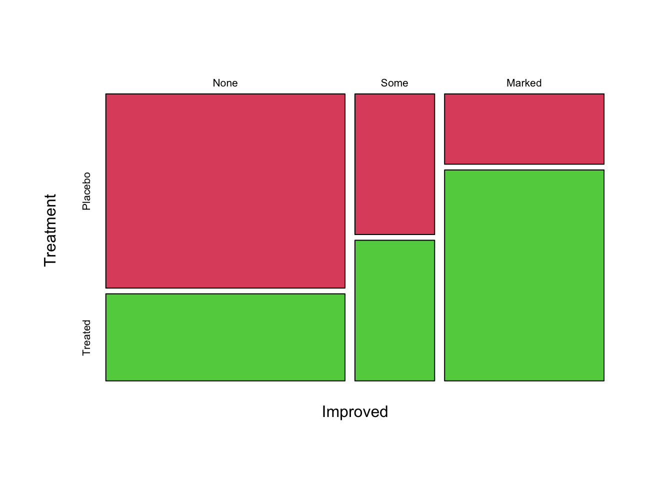
If we reverse the positions of Improved and Treatment in the function, it change the order in which the bars are split:
Task 1a
- Using the
mosaicplotcommand, try to reproduce the mosaicplot above - What are the new features that become apparent when you reverse the positions of the variables?
Click for solution
mosaicplot(~Improved+Treatment, data=arthritis, col=2:4,main='')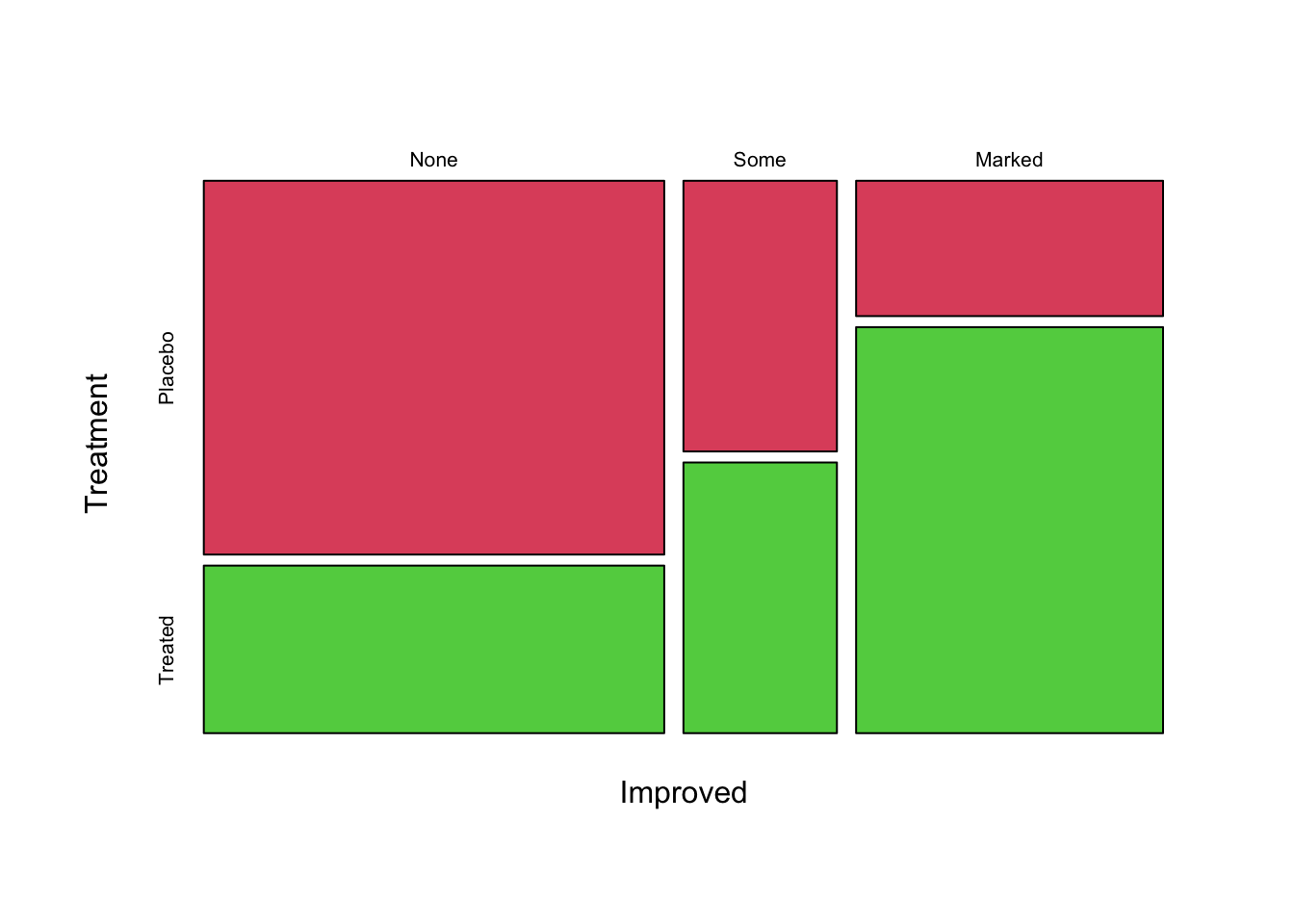
Improved, each sub-divided into the Treatment groups. This plot now shows how the patients with different Improved levels break down into the Treatment groups. So, we would read this as saying for those patients with a Marked improvement, the majority were Treated rather than given Placebo. Usually, it is best to split on the response variable at the end, as we had done in the previous plot.
More variables
We can continue to add variables to the plot and break down the results into more groups. For instance, we can introduce Sex as a variable
mosaicplot(~Treatment+Sex+Improved, data=arthritis,col=2:4,main='')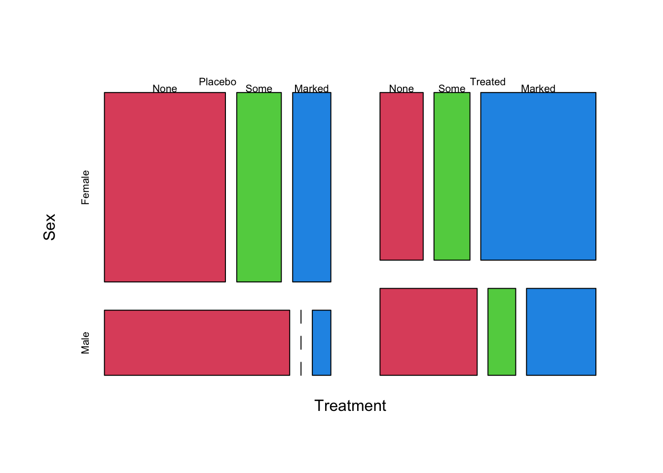
Here we can see:
- The Treatment groups look to be roughly equal in size
- There are fewer men than women in the study (the
Malerows are narrower than theFemale) - There are no
Malepatients in thePlacebogroup who only hadSomeimprovement - this is indicated by the dashed line where this bar should be. Treatmentappears to have a positive effectFemalepatients seemed to improve the most in general, and particularly underTreatment
It is often worth reordering the variables in the mosaic plot formula to see if a different sequence of splits is a more effective visualisation for your problem. Generally, our dependent variable of interest is split last following the ~ in the function call.
Task 1b
- Produce mosaicplots of combinations of one, two and three variables for the built-in R data set
HairEyeColor - Experiment with the ordering of the variables in the call to the
mosaicplotfunction to see how different orderings produce different presentations of the data. - Which visualisation best highlights the interesting patterns in the data?
Click for solution
data("HairEyeColor")

mosaicplot(~Hair, data=HairEyeColor,col=2:5,main='')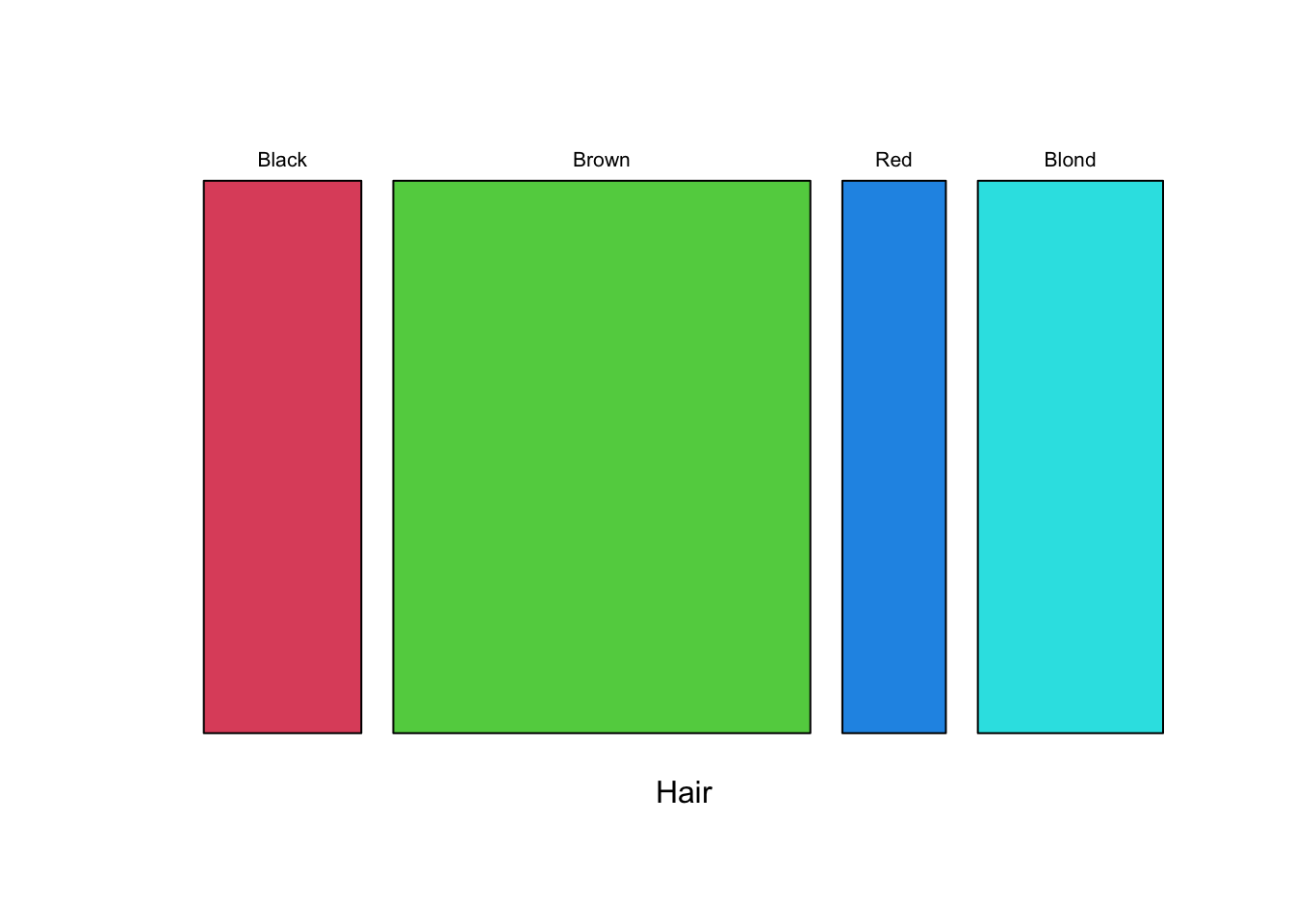
mosaicplot(~Hair+Sex, data=HairEyeColor,col=2:5,main='')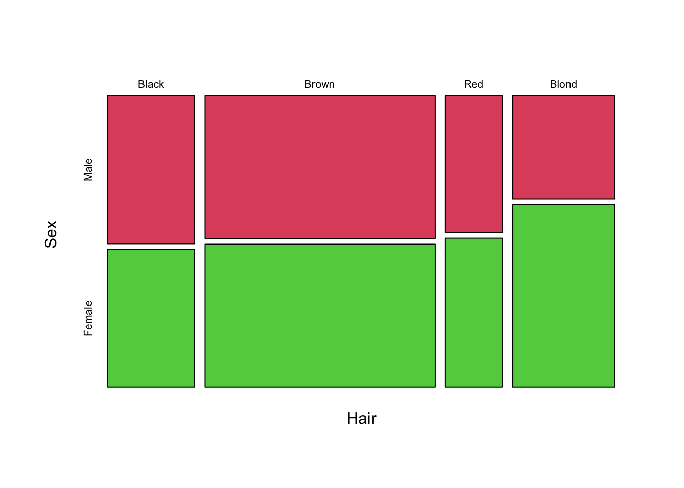
## With three variables there are 6 different orderings - here are a couple (with a different coloring option)
mosaicplot(~Hair+Sex+Eye, data=HairEyeColor,col=3:6,main='')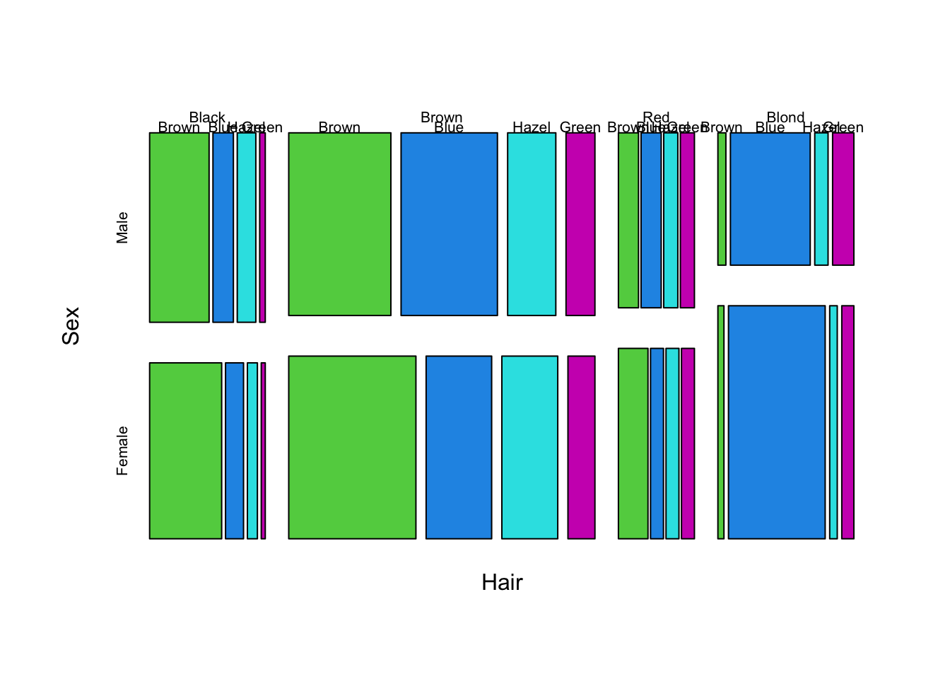
mosaicplot(~Eye+Hair+Sex, data=HairEyeColor,col=3:6,main='')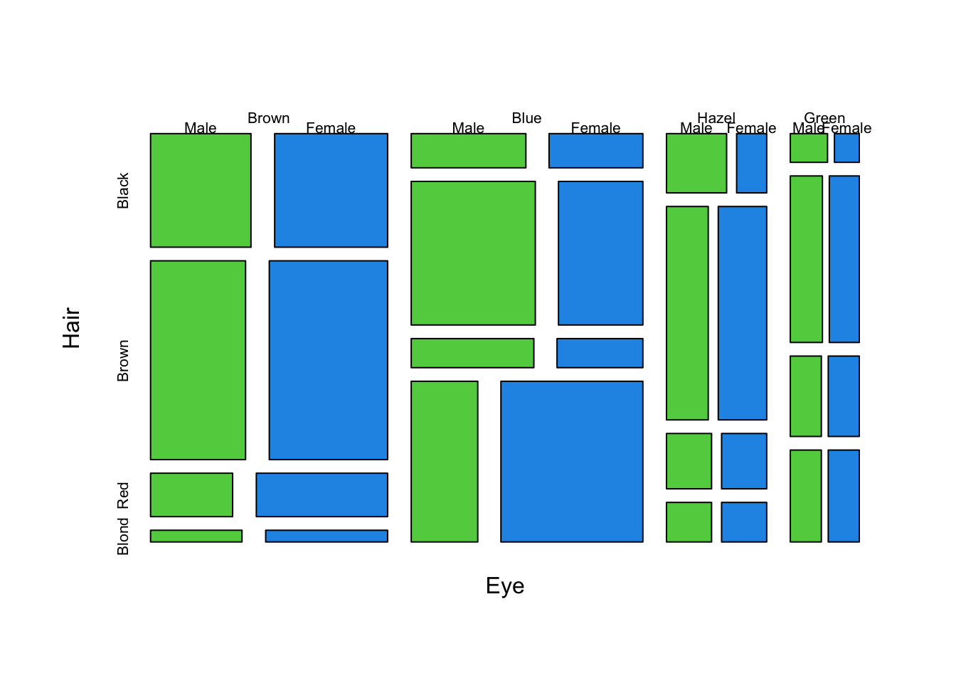
Directions of the splits
A doubledecker plot is a version of a mosiac plot where all of the splits in the data are vertical, except for the last one. This effectively produces a type of stacked barplot, which we can achieve by setting the direction argument as follows:
mosaicplot(~Treatment+Sex+Improved, data=arthritis, dir = c("v", "v", "h"),col=2:4)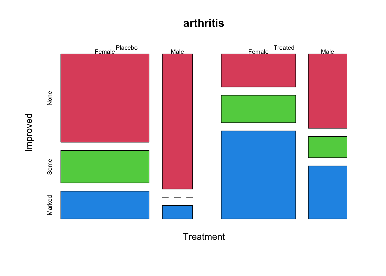
Or, using the doubledecker function directly gives an almost identical plot:
doubledecker(Improved~Treatment+Sex, data=arthritis)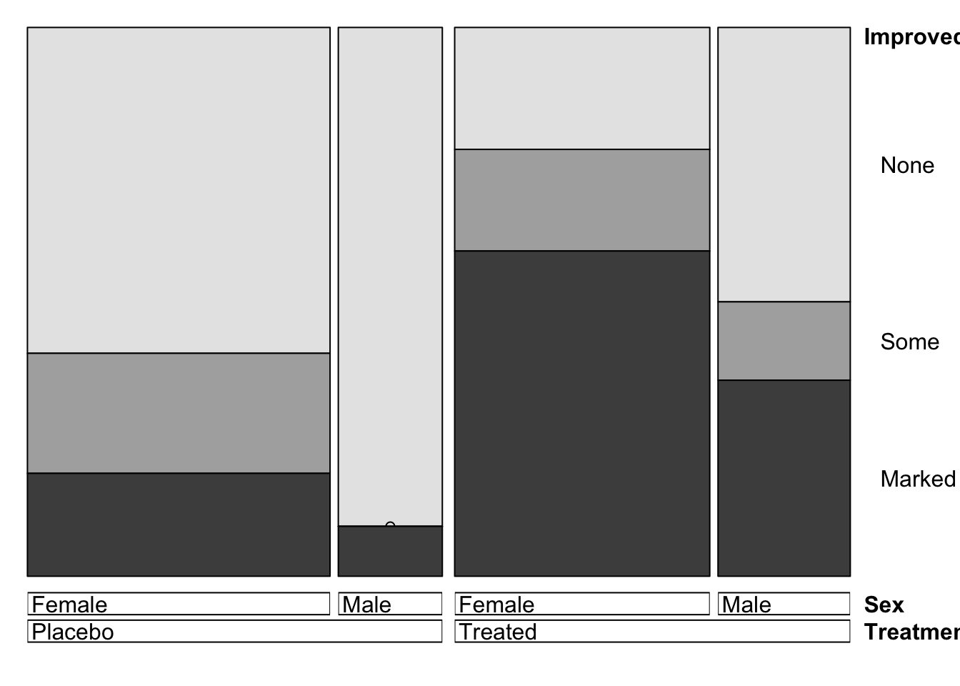
Adding some colour
The default plots are somewhat dull and monochrome. Note that the different shadings used in the plot correspond to the different levels of the last cut variable, i.e. the dependent variable which is Improved here. So, if we supply one colour for each level of that variable we get the following plot:
mosaicplot(~Treatment+Sex+Improved, data=arthritis, main='', col=c("wheat", "cornflowerblue", "tomato1"))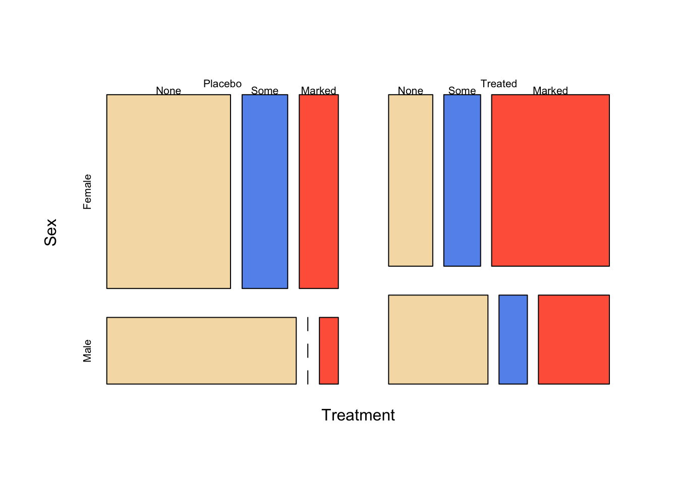
Note: In general, setting colours on mosaic plots can be quite fiddly. We won’t make much use of it, apart from an automatic coloring technique that we describe below.
Using colour to highlight unexpected patterns
A different but helpful use of colour is the shade=TRUE option. The shade=TRUE option works by colouring any tiles in the mosaic that are in disagreement with the independence hypothesis of a chi-square test. This can help us identify any combinations that are unusually common or rate:
mosaicplot(~Treatment+Sex+Improved, data=arthritis,shade=TRUE,main='')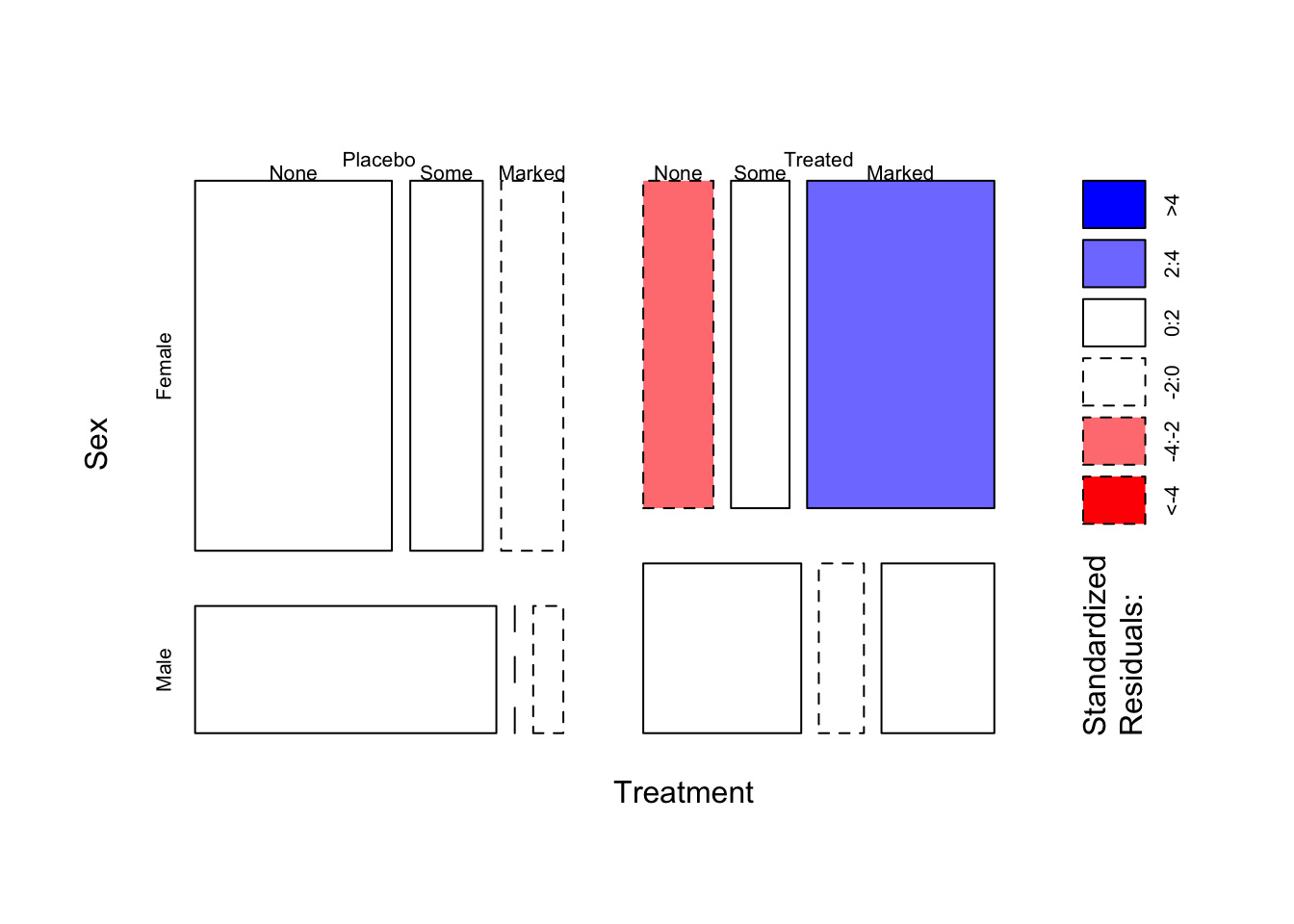
Tiles are shaded blue when more cases are observed than expected given independence, and shaded red when there are fewer cases than expected under independence. The strength of colour indicates how “surprising” those values are. The plot here is showing that most of the variation is not significant (coloured white), but in the Female and Treated group there is a surprisingly high number of patients who display a Marked improvement (blue-ish) - and consequently, fewer than expected (red-ish) whose improvement was None.
Task 1c
- Use the
mosaicplotfunction withshadeand thedirarguments to create a “doubledecker” version of the mosaic plot above.
Click for solution
mosaicplot(~Treatment+Sex+Improved, data=arthritis, shade=TRUE, main='',dir = c("v", "v", "h"))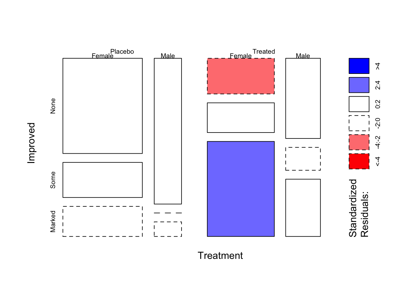
Exercise 2: Mosaicplots on a data set containing counts
Download data: alligator
The alligator data, from Agresti (2002), comes from a study of the primary food choices of alligators in four Florida lakes. The goal is to try and learn something about the food choice of the different alligators. The variables are:
lake- one of four lakes:George,Hancock,Oklawaha, andTraffordsex-maleorfemalesize-smallorlargefood- the food preferences of the alligators in five categories:fish,invertebrates,reptile,birdandother.
As usual, we begin with a quick look at the data to see what we’re dealing with:
head(alligator)| lake | sex | size | food | count |
|---|---|---|---|---|
| Hancock | male | small | fish | 7 |
| Hancock | male | small | invert | 1 |
| Hancock | male | small | reptile | 0 |
| Hancock | male | small | bird | 0 |
| Hancock | male | small | other | 5 |
| Hancock | male | large | fish | 4 |
Here, unlike the arthritis data, each row does not represent an individual alligator but all of the alligators found with the given combinations of categorical variables. So, for example, we have seen 7 alligators with attributes (Hancock, male, small, fish). This is a slightly different format than we saw above, so we’ll need to deal with it slightly differently.
To produce the counts needed for our plots, we need to use the cross-tabulation function xtabs that we used with our barplots. So, to generate the counts of alligators in each lake, we first compute
xtabs(count~lake, data=alligator)lake
George Hancock Oklawaha Trafford
63 55 48 53 and then pass this to our mosaic function for plotting:
mosaicplot(xtabs(count~lake, data=alligator),col=2:5)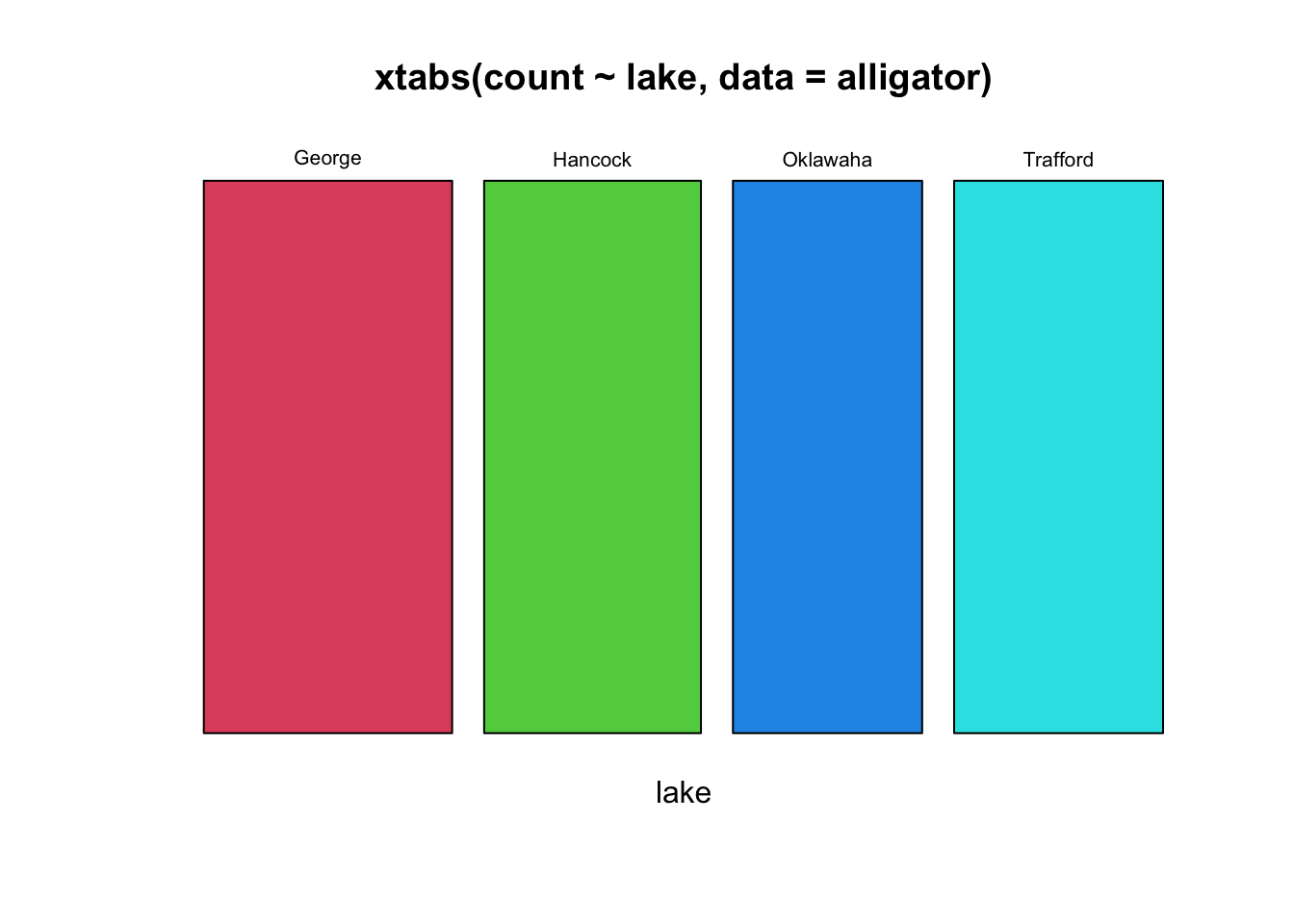
Alternatively, with a single variable we could just draw a barplot, which is probably a little easier to read!
barplot(xtabs(count~lake, data=alligator),col=2:5)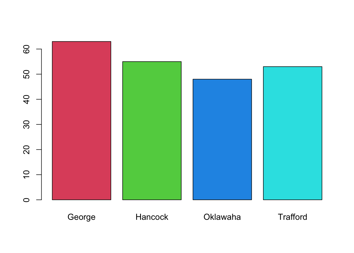
Note that the mosaicplot is showing the proportions in the different lakes by the width of the bars, whereas the barplot uses the height. We see there are slight differences between the numbers of alligators observed in the different lakes, but they don’t appear to be substantial.
Note that the only difference with working with these data (which include the counts as a variable) and the previous data set (which did not include the counts) is that we must do the aggregating of the data in the xtabs function first, instead of directly in mosaicplot. The syntax and formula for splitting the data is the same.
Task 2a
- Investigate the distributions of the other categorical variables individually:
sex,size, andfood. You can use whatever plot you prefer. Try and answer the following questions:- Are the sexes of alligators evenly distributed?
- What about the different sizes?
- Which food type is most popular?
Click for solution
mosaicplot(xtabs(count~sex, data=alligator))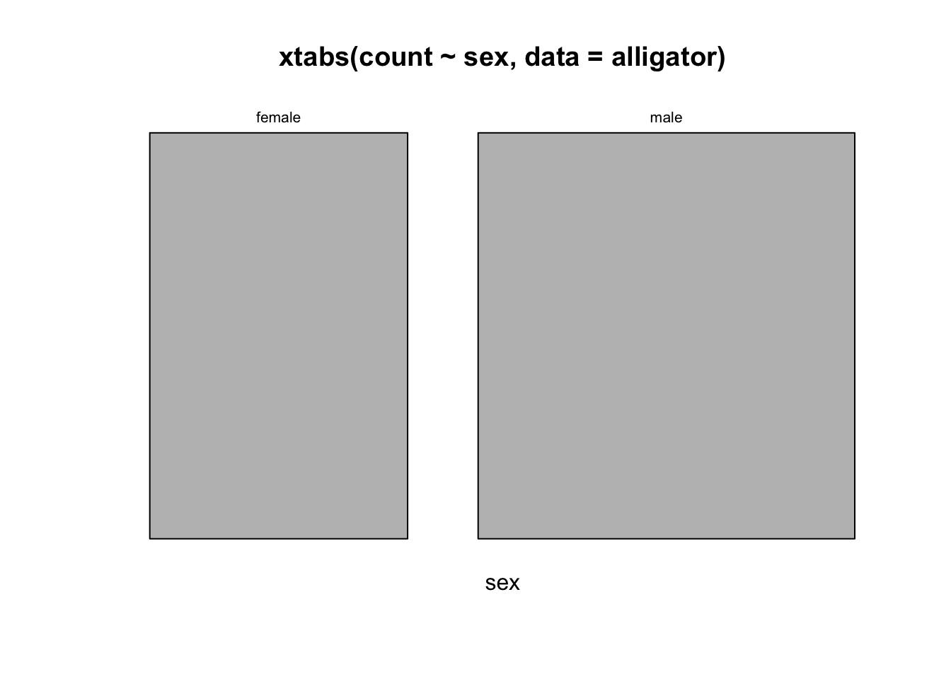
More males than female
mosaicplot(xtabs(count~size, data=alligator))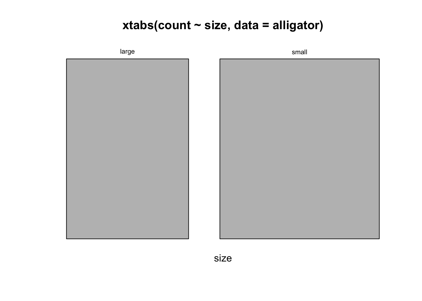
slightly more small than large
mosaicplot(xtabs(count~food, data=alligator))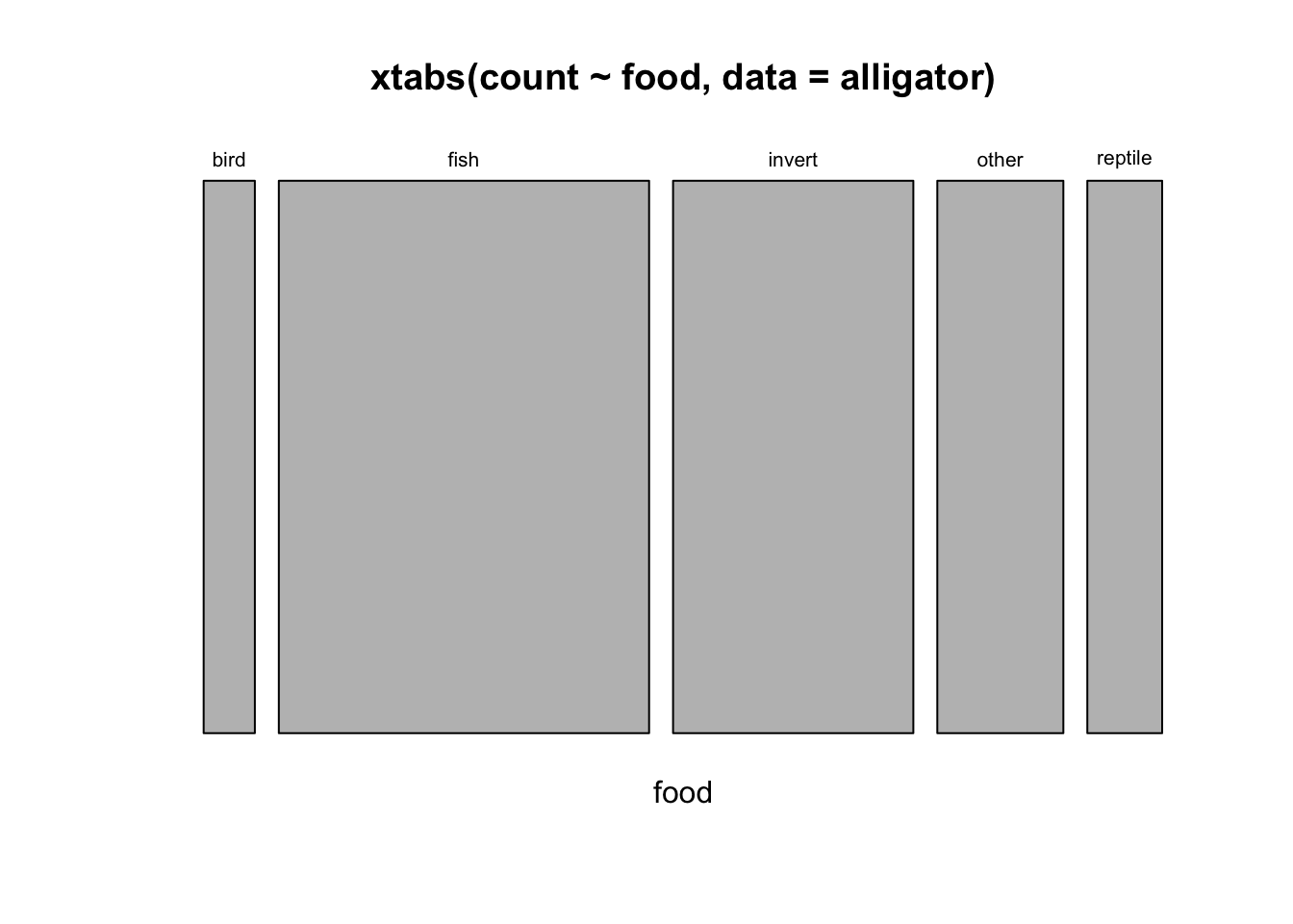
More than two variables
The strength of mosaic plots is when considering the combination of multiple categorical variables at once. To keep things manageable, let’s looks at some potentially interesting pairs of variables first:
Task 2b
- Use
mosaicplotto visualise thesizeandsexvariables together. Remember, if there is no association here then we would expect a regular grid. What associations do you find? - What about
sizeandfood? - Draw the
doubledeckerplots of the same variables - how do they compare to the mosaic plot?
Click for solution
mosaicplot(xtabs(count~size+sex, data=alligator))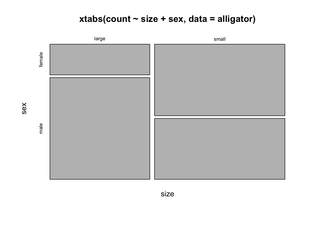
doubledecker(xtabs(count~size+sex, data=alligator))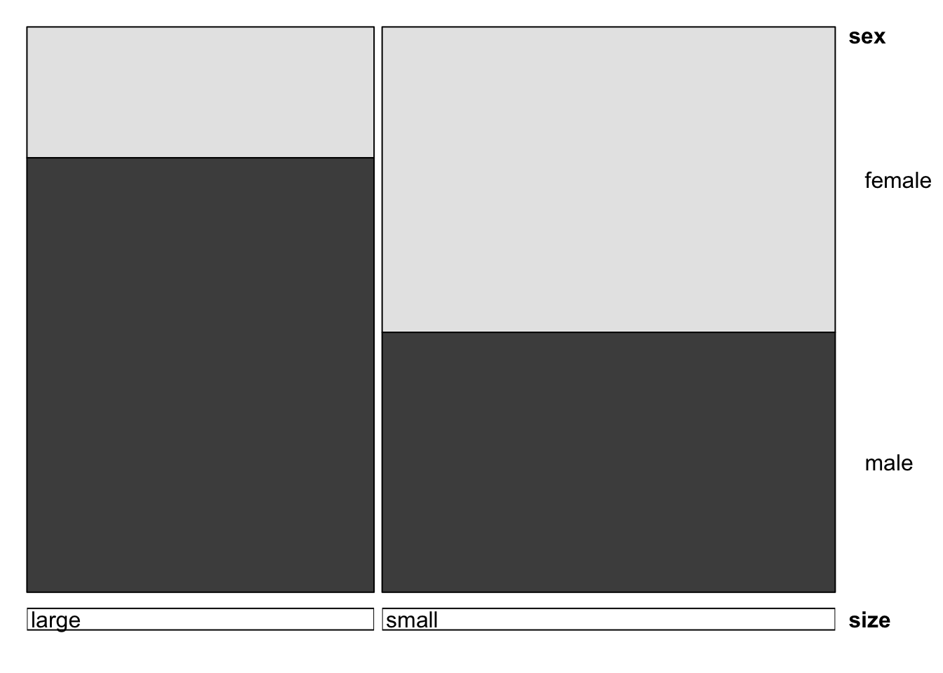
more males are larger, females are smaller
mosaicplot(xtabs(count~size+food, data=alligator))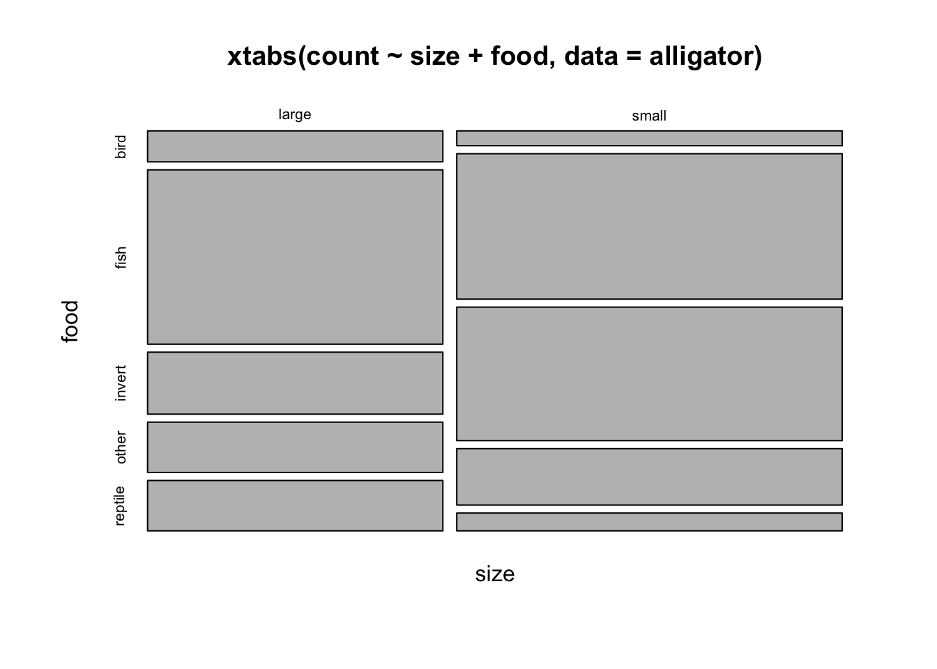
doubledecker(xtabs(count~size+food, data=alligator))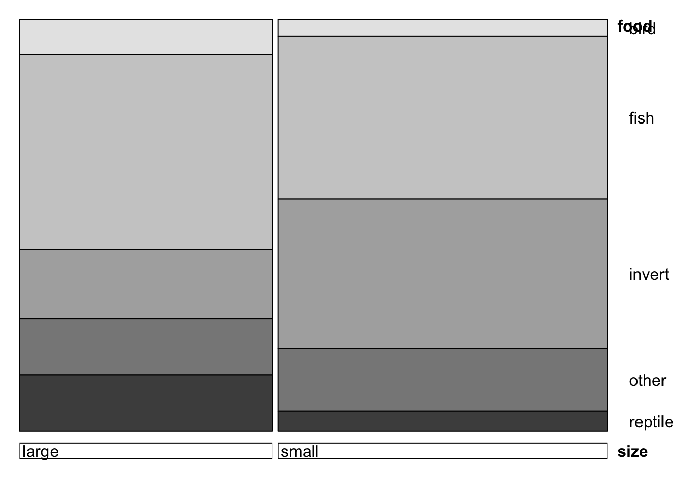
We can even make a matrix of all the two-way mosaic plots in the style of a scatterplot matrix by the following command:
pairs(xtabs(count~.,data=alligator))Using a . on the right side of the formula is a shorthand for “include everything”.
Task 2c
- Can you locate the plots of
sizeandsex, andsizeandfoodwithin the matrix? - Do you see any other potential associations (or lack of associations) here? Remember, “no association” will mean the mosaic is divided into an approximately regular grid.
- Make a doubledecker plot of
food,sizeandsex- order the variables so that each bar is split into sections according to thefood. - Now try the mosaic plot and use the
shade=TRUEoption. Try and achieve the same ordering so that food is the final split. What combinations have been highlighted, and how would you interpret them? - Do you see any other potentially interesting features here?
Click for solution
Size:sex plot is in position (1,3), size:food is in (3,4). Seem to be a fair few associations here, except for food:sex Let’s take a closer look:
mosaicplot(xtabs(count~sex+food, data=alligator))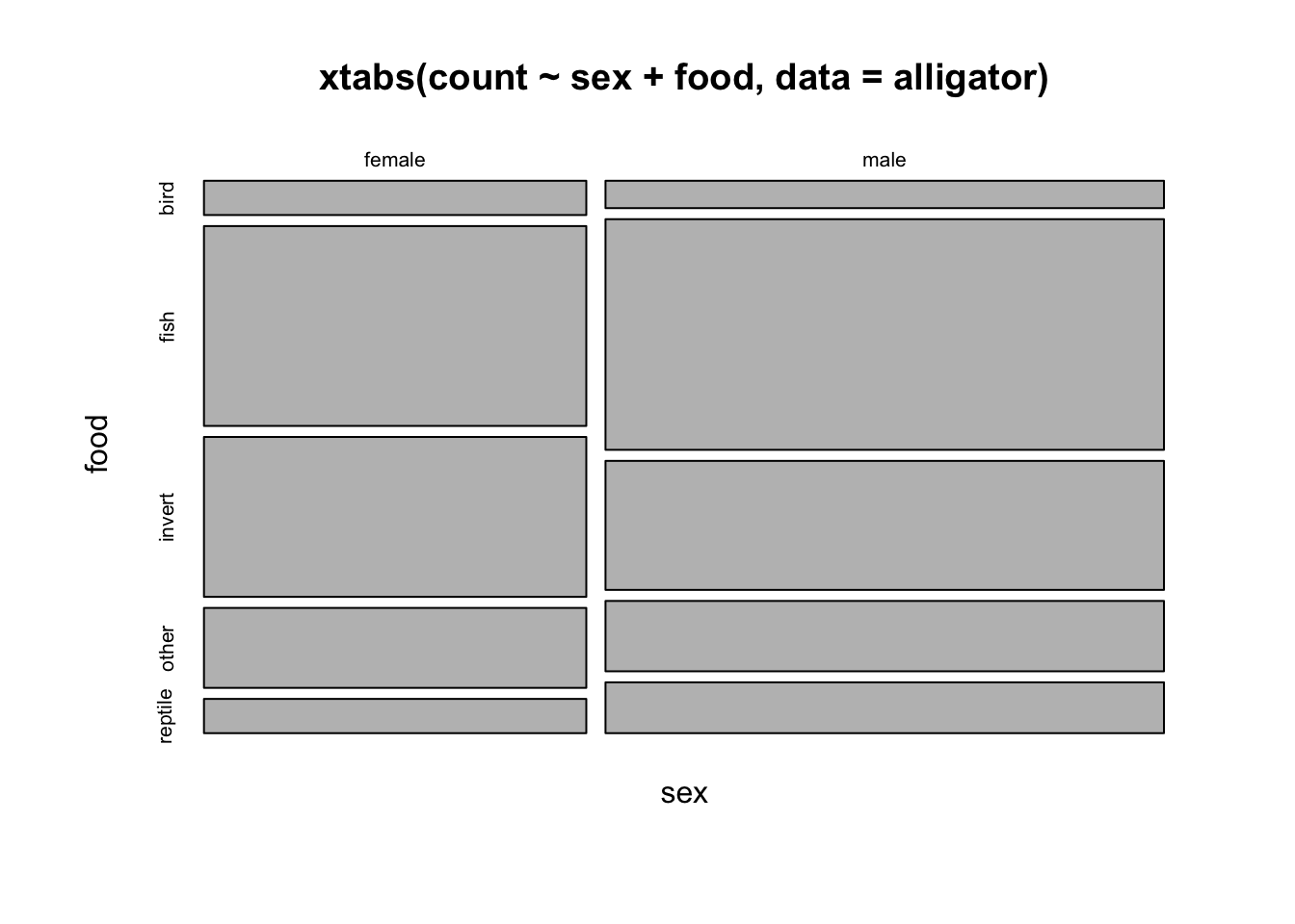
This looks pretty regular, no obvious surprisingly large/small blocks. Let’s try shading the big plot for more emphasis
pairs(xtabs(count~.,data=alligator), shade=TRUE)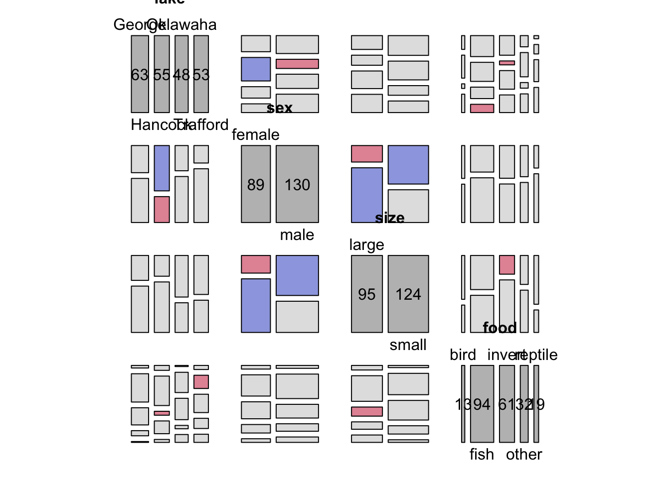
Combining more that two variables in a mosaic can get a bit crazy. Let’s look at size, sex and food all together.
doubledecker(xtabs(count~size+sex+food, data=alligator))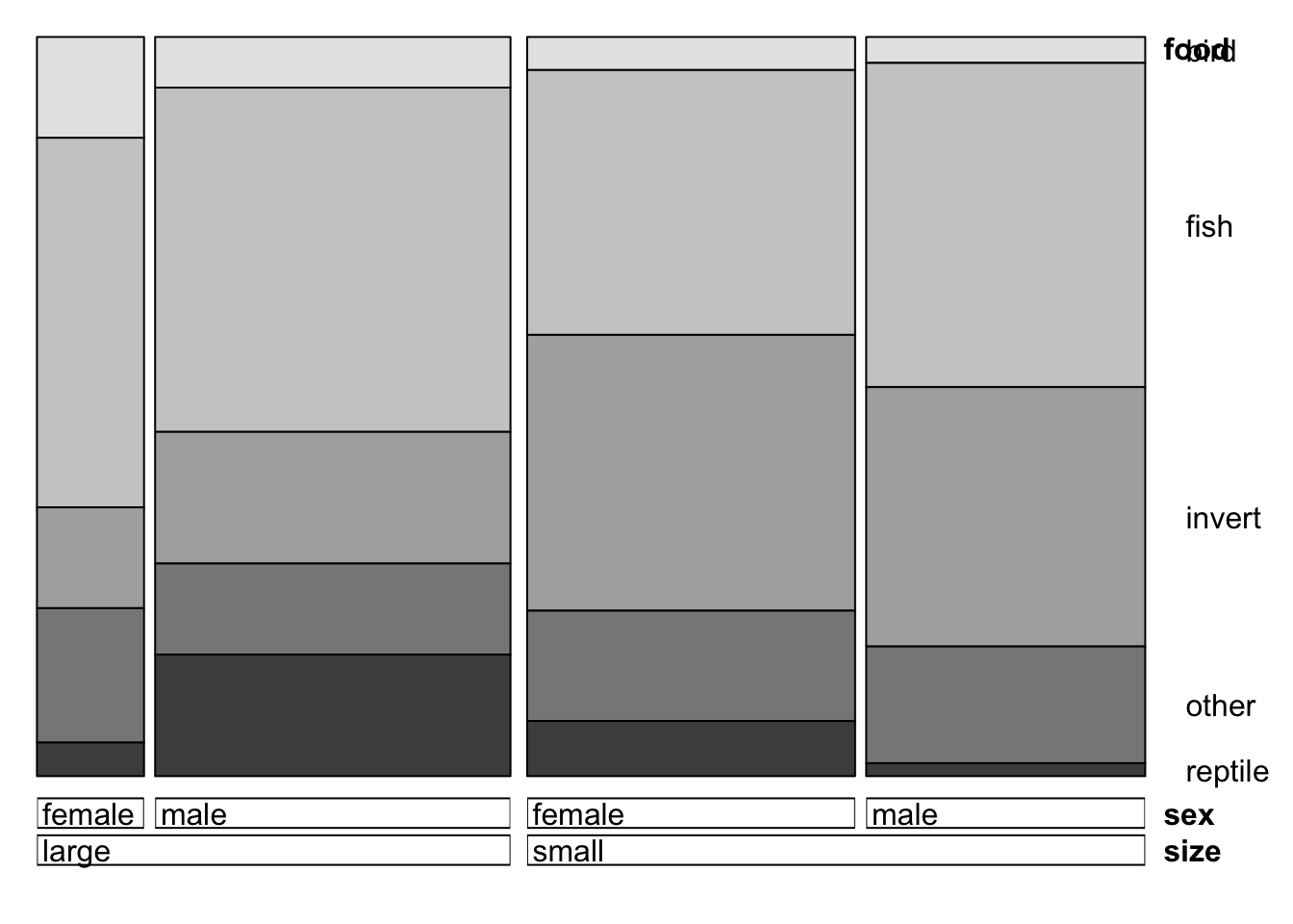
mosaicplot(xtabs(count~size+sex+food, data=alligator),shade=TRUE)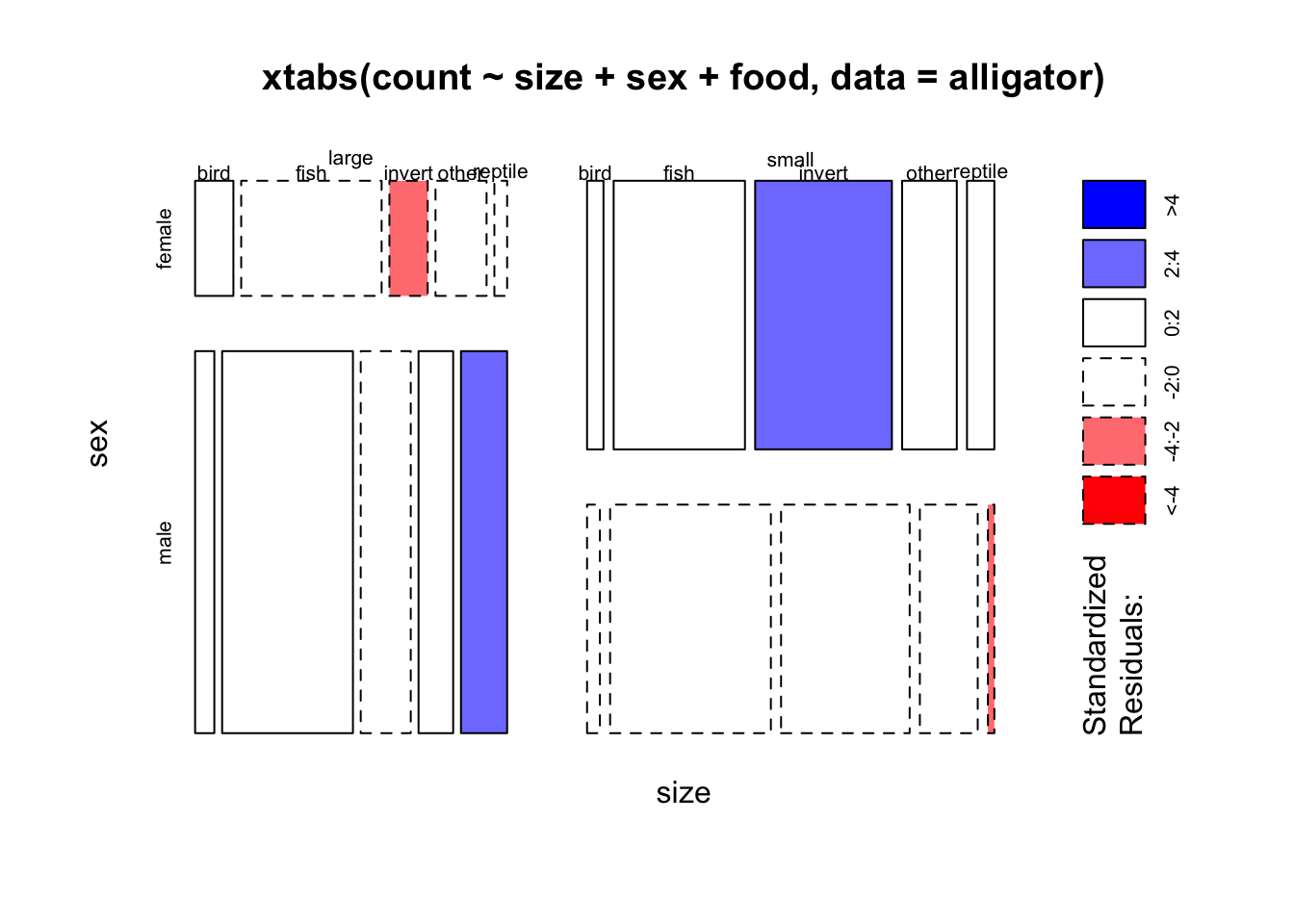
Large males eat more reptiles, small males eat surprisingly few (are they eating each other…?) Small females eat more invertebrates, large females eat few
The four-way table goes a bit mad
mosaicplot(xtabs(count~size+sex+food+lake, data=alligator),shade=TRUE)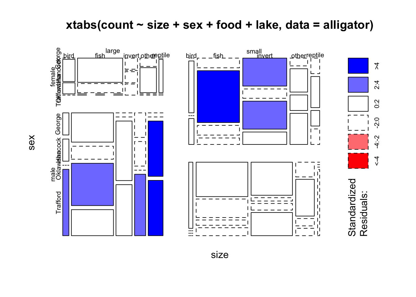
Exercise 3 (for extra practice): Grouped and stacked barplots
Barplots can be used effectively to display combinations of categorical variables. However, they require a little more setup to provide the data in the correct format.
First, a grouped barplot displays a numeric value (e.g. counts) split in groups and subgroups. A few explanation about the code below: * the input dataset must be a numeric matrix. Each group is a column. Each subgroup is a row. So we can only deal with two variables at once. * the barplot function will recognize this format, and automatically perform the grouping for you. * the beside option allows to toggle between the grouped and the stacked barchart
## make a table of counts by Treatment and Improved from the arthritis data
tab <- xtabs(~Improved+Treatment,data=arthritis)
tab
Treatment
Improved Placebo Treated
None 29 13
Some 7 7
Marked 7 21# Grouped barplot
barplot(tab, beside=TRUE, legend=rownames(tab), col=2:4)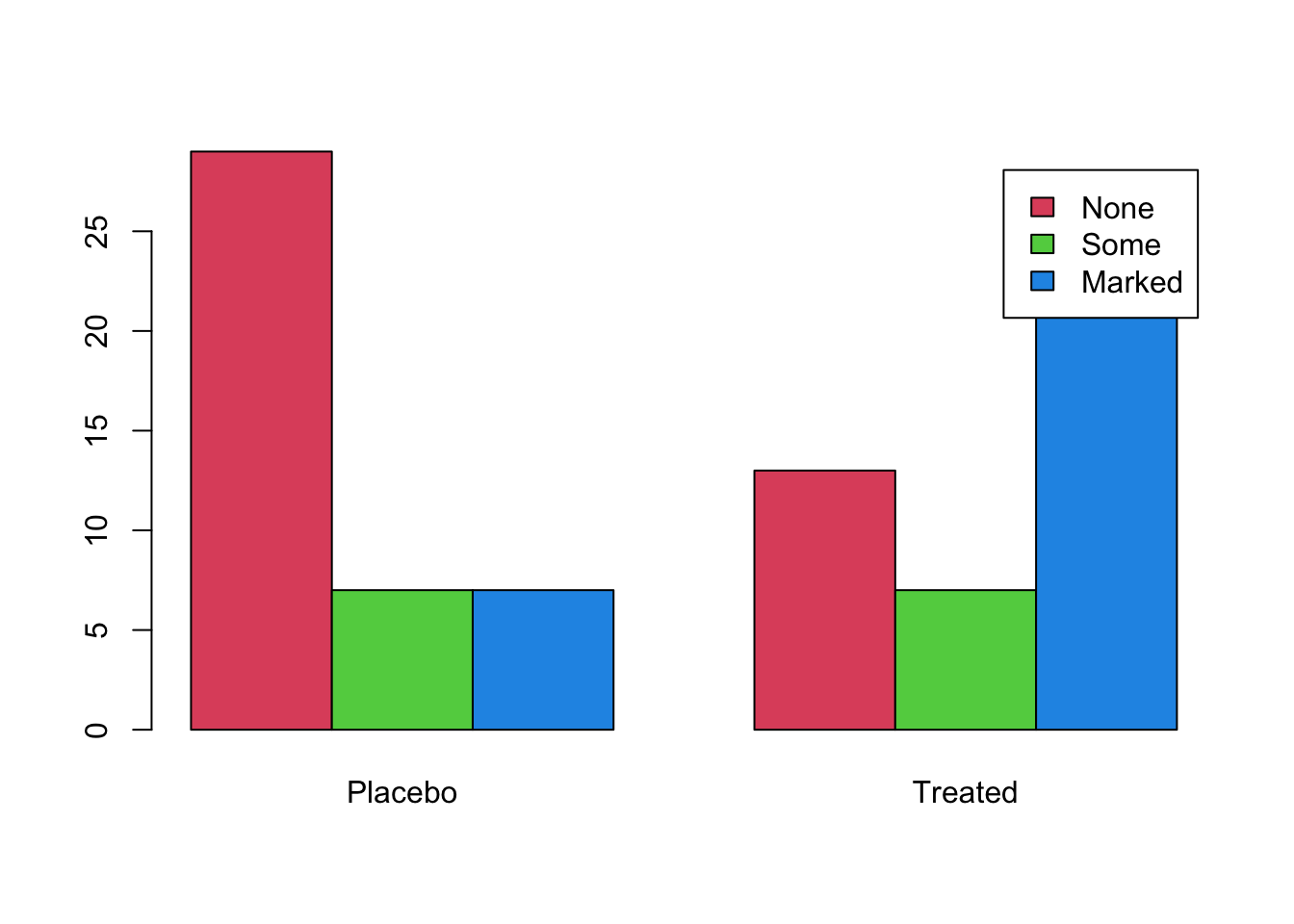
And to stack the bars, set beside=FALSE
barplot(tab, beside=FALSE, legend=rownames(tab), col=2:4)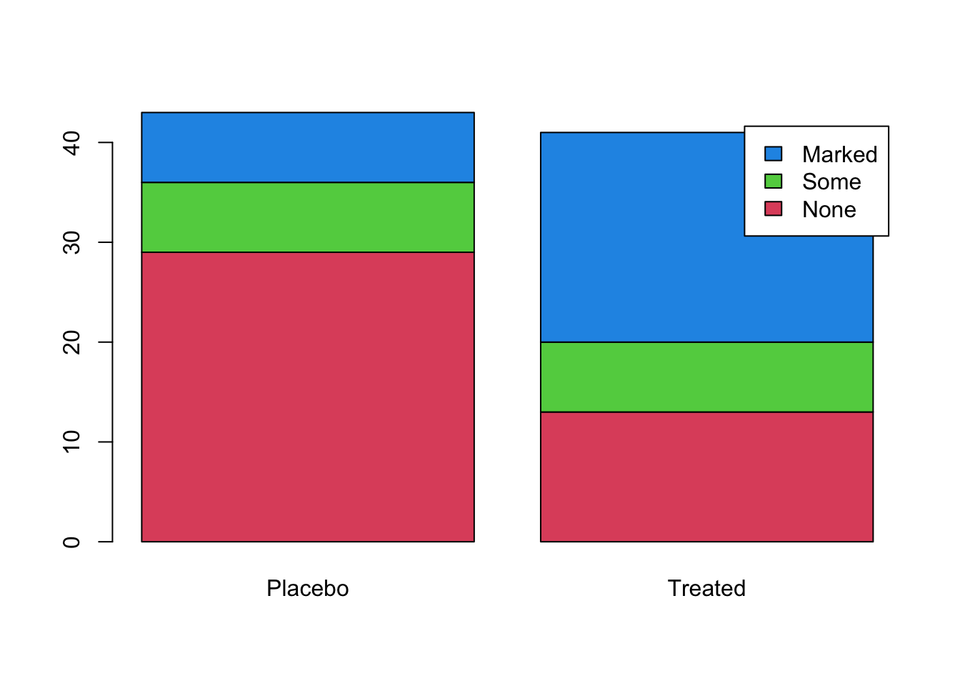
Stacked bars are often used to display the proportions of the respective columns attributable to each sub-group. Thankfully, we can easily convert tables of counts to proportions with the prop.table function. If we want the proportions computed within a column, set the margin=2 argument:
barplot(prop.table(tab, margin=2), beside=FALSE, legend=rownames(tab), col=2:4)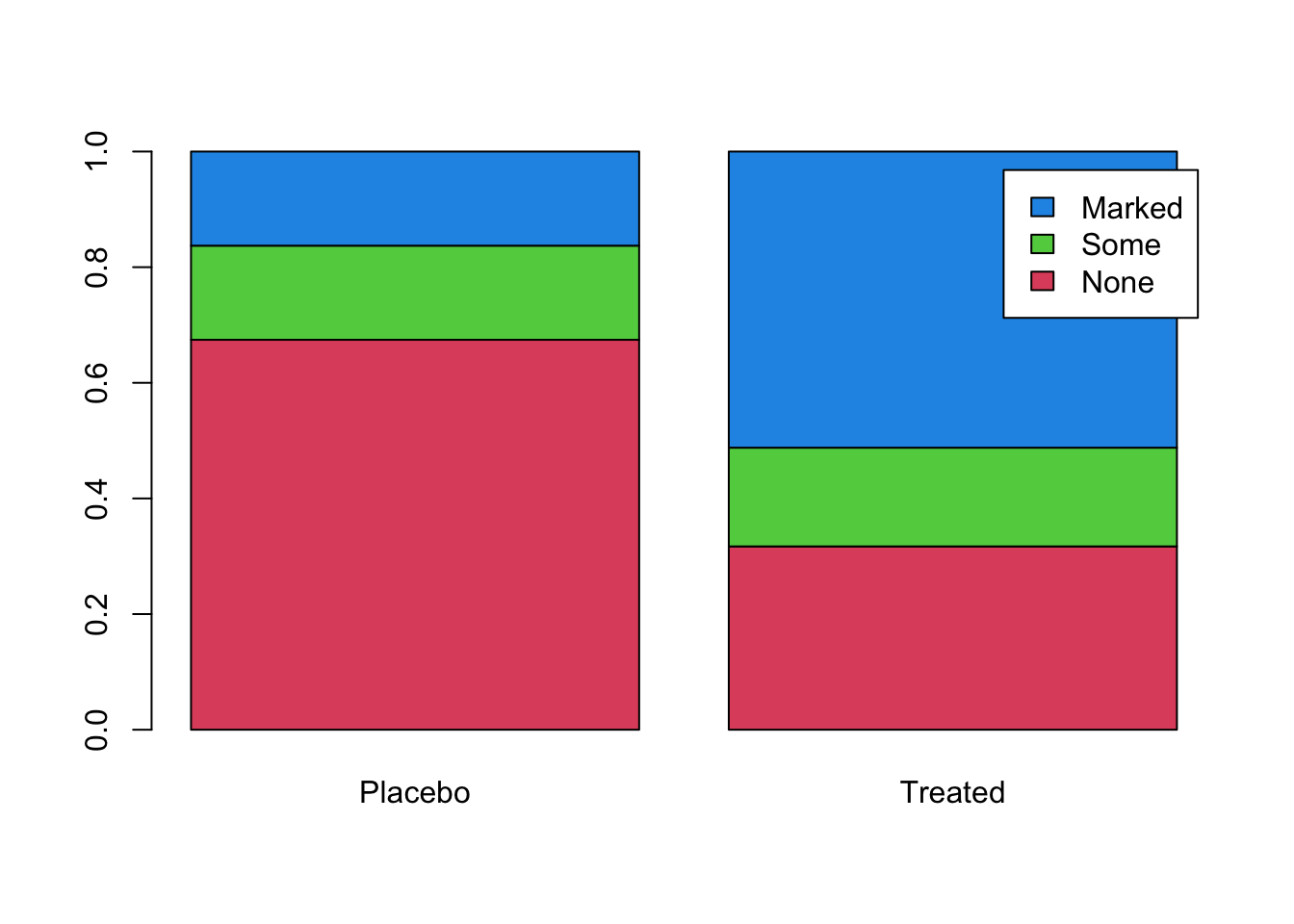
Data set: Airline arrivals
We are now going to compare all the techniques seen so far on a new dataset.
Download data: airlineArrival
The airlineArrival data contains 11000 observations of 3 categorical variables: * Airport - a factor with levels LosAngeles, Phoenix, SanDiego, SanFrancisco, Seattle * Result - a factor with levels Delayed,OnTime * Airline - a factor with levels Alaska, AmericaWest
Task 3a
- Create a grouped barplot of the counts of delayed flights versus ontime flights for both levels of the
Airlinevariable. - Create a stacked barplot of the same data above
- Is there much difference in the amount of delayed flights between the two airlines? Which plot is better to assess this?
Click for solution
tab <- xtabs(~Result+Airline,data=airlineArrival)

# Grouped barplot
barplot(tab, beside=TRUE, legend=rownames(tab), col=c(2,7))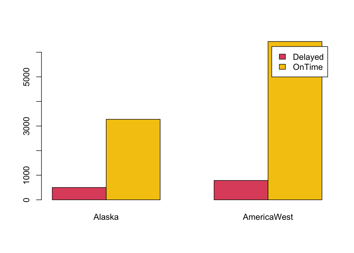
# Stacked barplot
barplot(prop.table(tab, margin=2), beside=FALSE, legend=rownames(tab), col=c(2,7))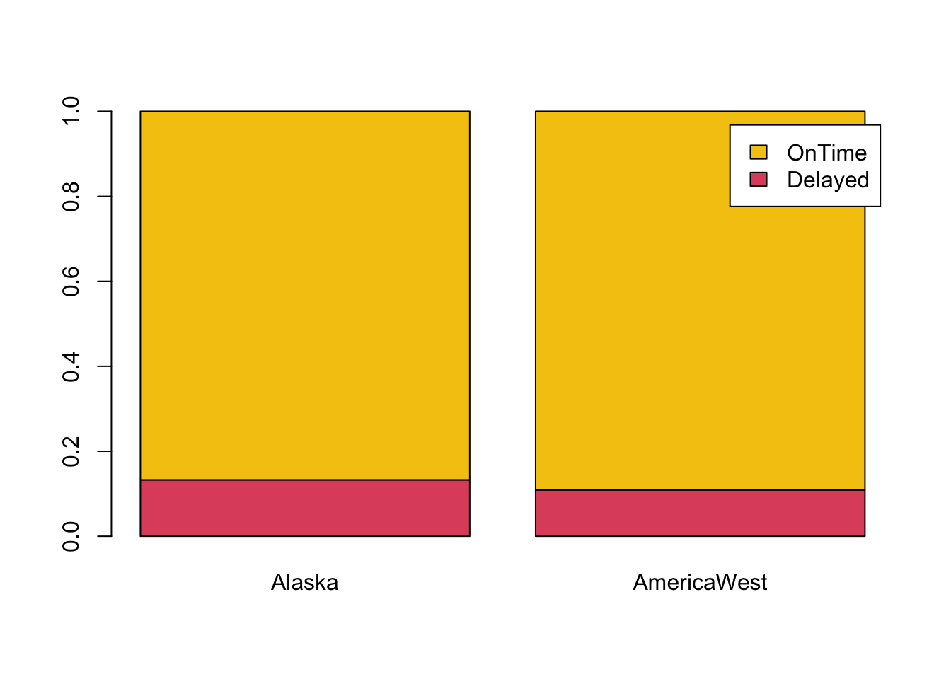
Task 3b
- Produce grouped and stacked barcharts of counts of
AirportagainstResult. What is the response variable here?- Which airports look best for flights being on time? Which look worst?
Click for solution
tab <- xtabs(~Result+Airport,data=airlineArrival)

# Grouped barplot
barplot(tab, beside=TRUE, legend=rownames(tab), col=c(2,7))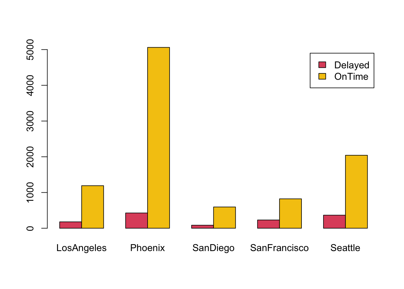
# Stacked barplot
barplot(prop.table(tab, margin=2), beside=FALSE, legend=rownames(tab), col=c(2,7))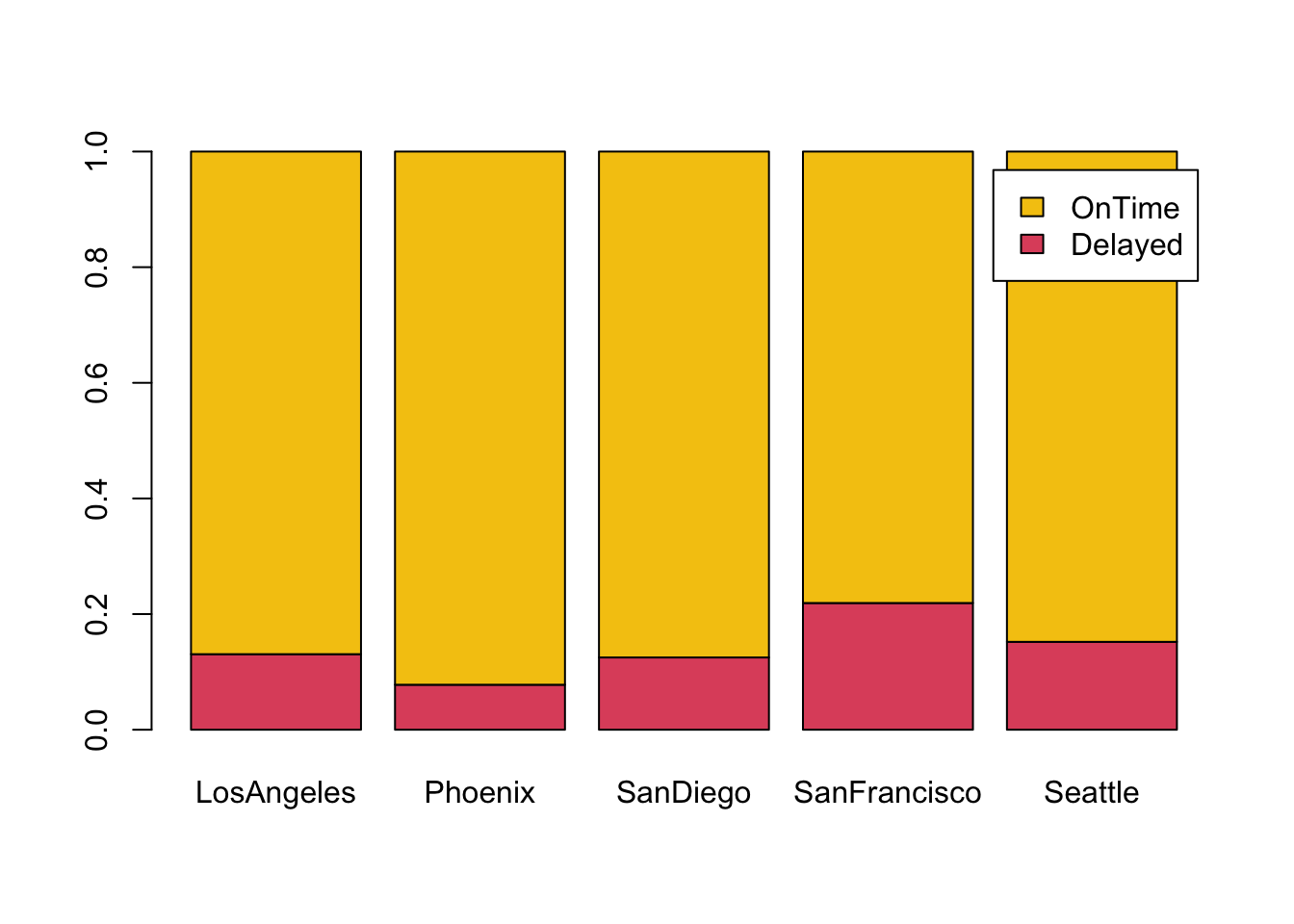
Once again, stacked plots are more useful: Result is clearly the response variable here and hence we need to produce five different bars.
Task 3c
- Now look at whether both
AirportandAirlineare associated with delays by producing a mosaicplot and a doubledecker plot of all three variables. - What do you find? Try turning on
shade=TRUE. - In which plot are the associations most pronounced?
Click for solution
Here is the mosaicplot:
mosaicplot(~Airport+Result+Airline, data=airlineArrival,col=c(2,7),main='')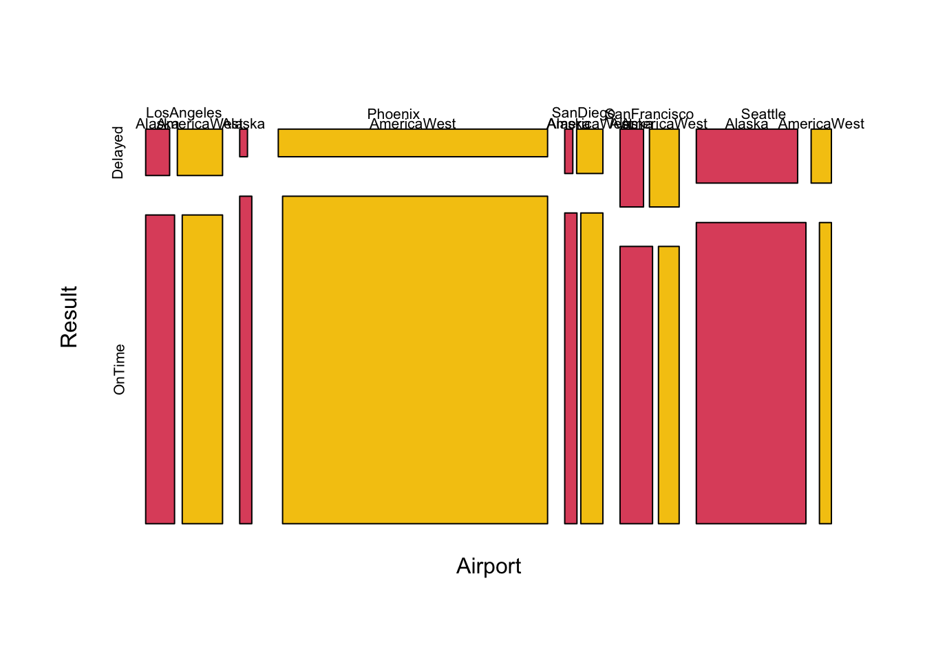
Without reformatting, it is hard to infer any possible associations from this. In fact, while some differences between airports exist, the contribution of the airline variable doesn’t show a clear pattern. THis is due to the relatively wide size of the empty spaces in a mosaicplot.
In this sense, the doubledecker plot gives a more precise picture
doubledecker(xtabs(~Airport+Airline+Result, data=airlineArrival))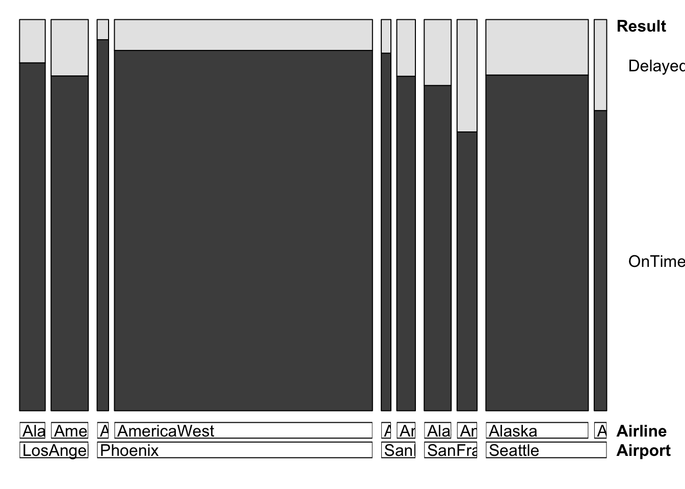
There one can see that airlines show differences: Alaska airlines flights are slightly more on time compared to AmericaWest flights, from every airport in the data set.
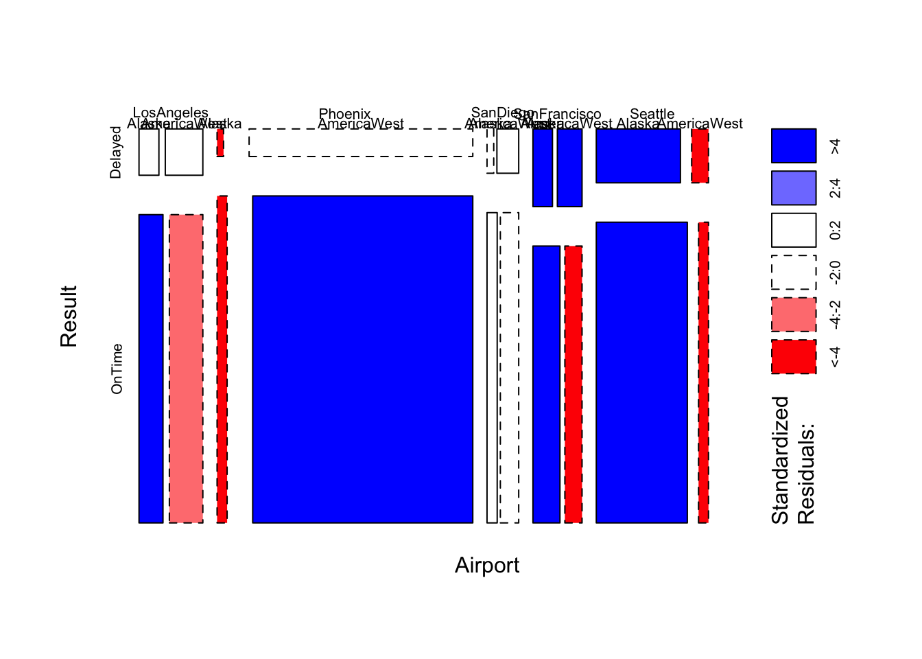
The shaded mosaicplot confirms this finding, and gives much more information about unusual associations:
mosaicplot(~Airport+Result+Airline, data=airlineArrival, col=c(2,7), shade=TRUE, main='')