Workshop 4 - More functions for EDA

Introduction

In this workshop, we tie together some of the topics seen so far, and explore more functions that help us with exploratory data analysis.

By the end of the workshop, you will have seen how to:

  • Manipulate dataframes using dplyr
  • Use the grammar of graphics required to draw plots with ggplot
  • Perform exploratory data analysis on a data set of multiple time series with missing data

Packages needed (if you want to replicate this outside the NCC) are tidyverse, naniar, and scales.

library(tidyverse)   # ggplot2, dplyr, tidyr, readr
── Attaching core tidyverse packages ──────────────────────── tidyverse 2.0.0 ──
✔ dplyr     1.1.4     ✔ readr     2.1.5
✔ forcats   1.0.0     ✔ stringr   1.5.1
✔ ggplot2   3.5.1     ✔ tibble    3.2.1
✔ lubridate 1.9.4     ✔ tidyr     1.3.1
✔ purrr     1.0.2     
── Conflicts ────────────────────────────────────────── tidyverse_conflicts() ──
✖ dplyr::filter() masks stats::filter()
✖ dplyr::lag()    masks stats::lag()
ℹ Use the conflicted package (<http://conflicted.r-lib.org/>) to force all conflicts to become errors
library(naniar)      # missing data visualization
library(scales)

Attaching package: 'scales'

The following object is masked from 'package:purrr':

    discard

The following object is masked from 'package:readr':

    col_factor

Case Study: Gapminder Data

Download data: gap_miss

Rows: 29,393
Columns: 8
$ country    <fct> "Afghanistan", "Albania", "Algeria", "Angola", "Argentina",…
$ year       <dbl> 1800, 1800, 1800, 1800, 1800, 1800, 1800, 1800, 1800, 1800,…
$ pop        <int> 3280000, 400000, 2500000, 1570000, 534000, 200000, 3000000,…
$ lifeExp    <dbl> 28.2, 35.4, 28.8, 27.0, 33.2, 34.0, 34.4, NA, 25.5, 40.0, 3…
$ gdpPercap  <int> 603, 667, 715, 618, 1640, 817, 1850, 1240, 876, 2390, 597, …
$ fertility  <dbl> 7.00, 4.60, 6.99, 6.93, 6.80, 6.50, 5.10, 7.03, 6.70, 4.85,…
$ infantMort <dbl> 469, 375, 460, 486, 402, 391, 387, 440, 508, 322, 430, 405,…
$ continent  <fct> Asia, Europe, Africa, Africa, Americas, Oceania, Europe, As…
The data contain values for population, life expectancy, GDP per capita, population, fertility and infant mortality, every years, from 1900 to 2020. The variables are:

  • country - the country, factor with 142 levels
  • continent - the continent, factor with 5 levels
  • year - year of observation ranges from 1900 to 2020
  • lifeExp - life expectancy at birth, in years
  • pop - population
  • gdpPercap - GDP per capita (US$, inflation-adjusted)
  • infantMort - Death of children under 5 years of age per 1000 live births
  • fertility - The number of children that would be born to each woman with prevailing age-specific fertility rates

This data set is quite complex, as we have five time series observed for multiple countries (i.e. a categorical variable with many levels).

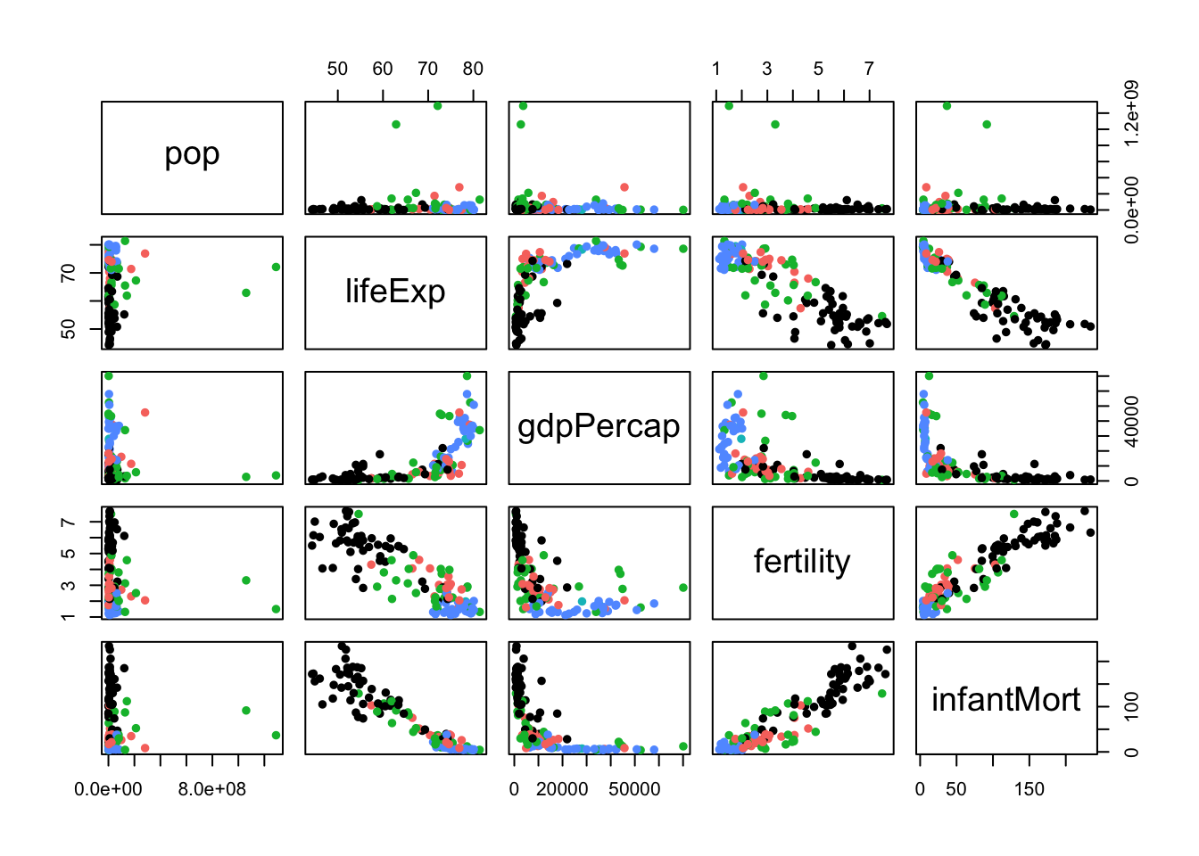
To get a feeling for the data, let’s focus on a particular picture of the state of the world in one year - let’s take 2000.

# subset the data
gm.2000 <- gap_miss[gap_miss$year==2000,]
# a pairs plot to look for associations
pairs(gm.2000[,3:7],pch=16,col=gm.2000$continent)

## some strong correlations, and mix of linear/nonlinear relationships
## seems to be an association with continent
## some outliers in population - India and China
rownames(gm.2000) <- gm.2000$country


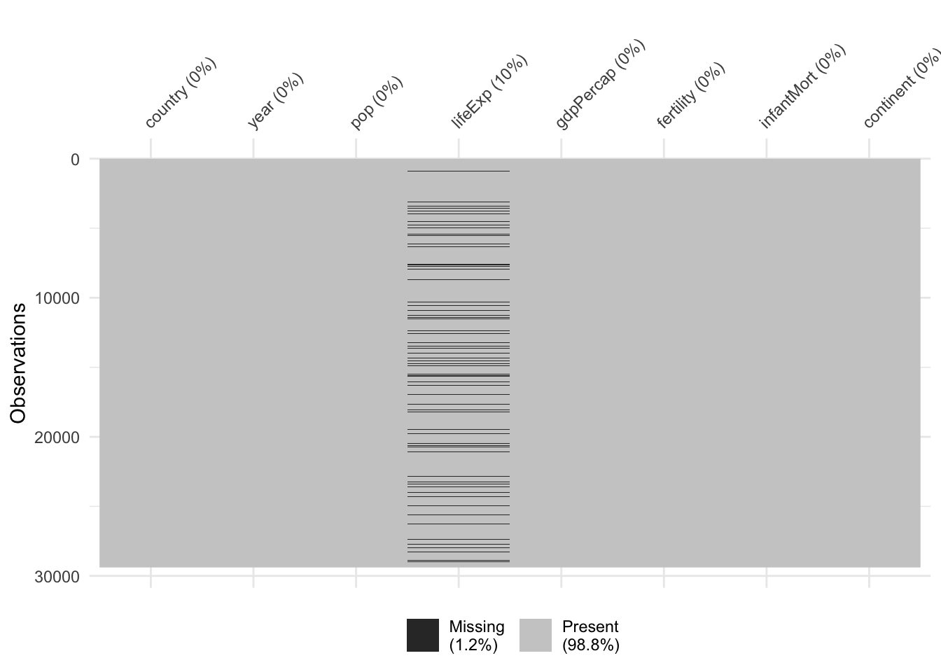
We soon note that 10% of the lifeExp data is missing. Missingness doesn’t seem to follow a precise pattern based on observable variables, but we need more exploration.

colSums(is.na(gap_miss))
   country       year        pop    lifeExp  gdpPercap  fertility infantMort 
         0          0          0       2939          0          0          0 
 continent 
         0 
vis_miss(gap_miss)

Making graphics with ggplot()

The package ggplot2 is built on the Grammar of Graphics. Every plot is made of layers, and almost every call looks like:

ggplot(data, aes(...)) + geom_...() + labs_...() + scale_...() + theme_...().

Not all these layers are necessary! The first layer creates a grid: not very interesting

gap_2000 <- gap_miss |> filter(year == 2000)
ggplot(gap_2000, aes(lifeExp))

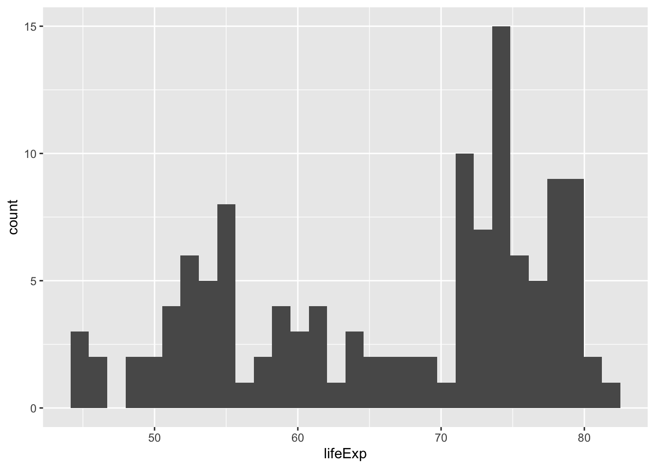
By using the fisrt two layers, we can already create some basics visualisation, such as histograms

ggplot(gap_2000, aes(lifeExp)) +
geom_histogram()
`stat_bin()` using `bins = 30`. Pick better value with `binwidth`.
Warning: Removed 10 rows containing non-finite outside the scale range
(`stat_bin()`).

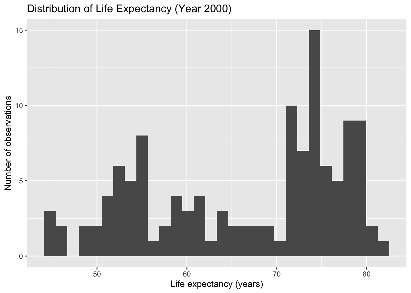
We can now add settings and a new layer that specifies labels

ggplot(gap_2000, aes(x = lifeExp)) +
  geom_histogram(bins = 30, na.rm = TRUE) +
  labs(
    title = "Distribution of Life Expectancy (Year 2000)",
    x = "Life expectancy (years)",
    y = "Number of observations"
  )

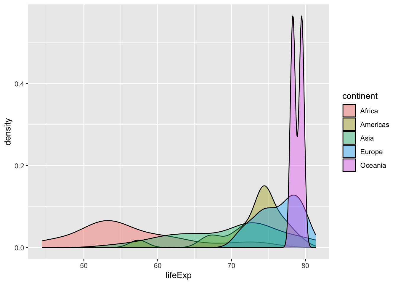
If we want to explore the distributions of different subgroups, we need to make sure that the second variables is included in the aesthetic, and we change the geometry to geom_density.

ggplot(gap_2000, aes(x = lifeExp, fill = continent)) +
  geom_density(alpha = 0.4, na.rm = TRUE)

ggplot automatically splits the data by continent, computes one density per group and assigns colors. Quite impressive compared to base R!

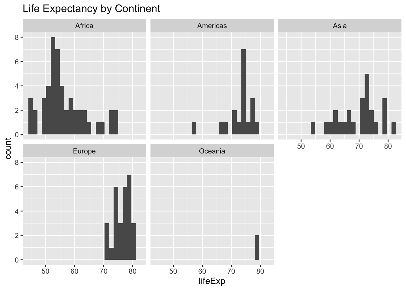
Another option for comparing continents is to use faceting

ggplot(gap_2000, aes(x = lifeExp)) +
  geom_histogram(bins = 25, na.rm = TRUE) +
  facet_wrap(~ continent) +
  labs(title = "Life Expectancy by Continent")

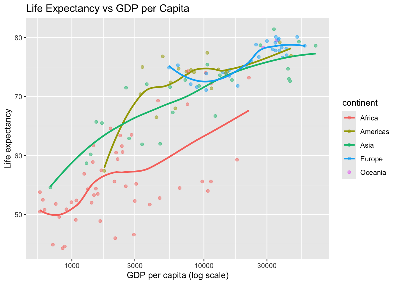
And the beauty of it is that it makes it intuitive to superimpose multiple layers. Let’s try to draw a scatterplot of (log-transformed) gdpPercap versus lifeExp with colouring depending on continent and a smoothing line for each group

ggplot(gap_2000, aes(x = gdpPercap, y = lifeExp, color = continent)) +
  geom_point(alpha = 0.5, na.rm = TRUE) +
  geom_smooth(se = FALSE, na.rm = TRUE) +
  scale_x_log10() +
  labs(
    title = "Life Expectancy vs GDP per Capita",
    x = "GDP per capita (log scale)",
    y = "Life expectancy"
  )
`geom_smooth()` using method = 'loess' and formula = 'y ~ x'

Now it’s your turn:

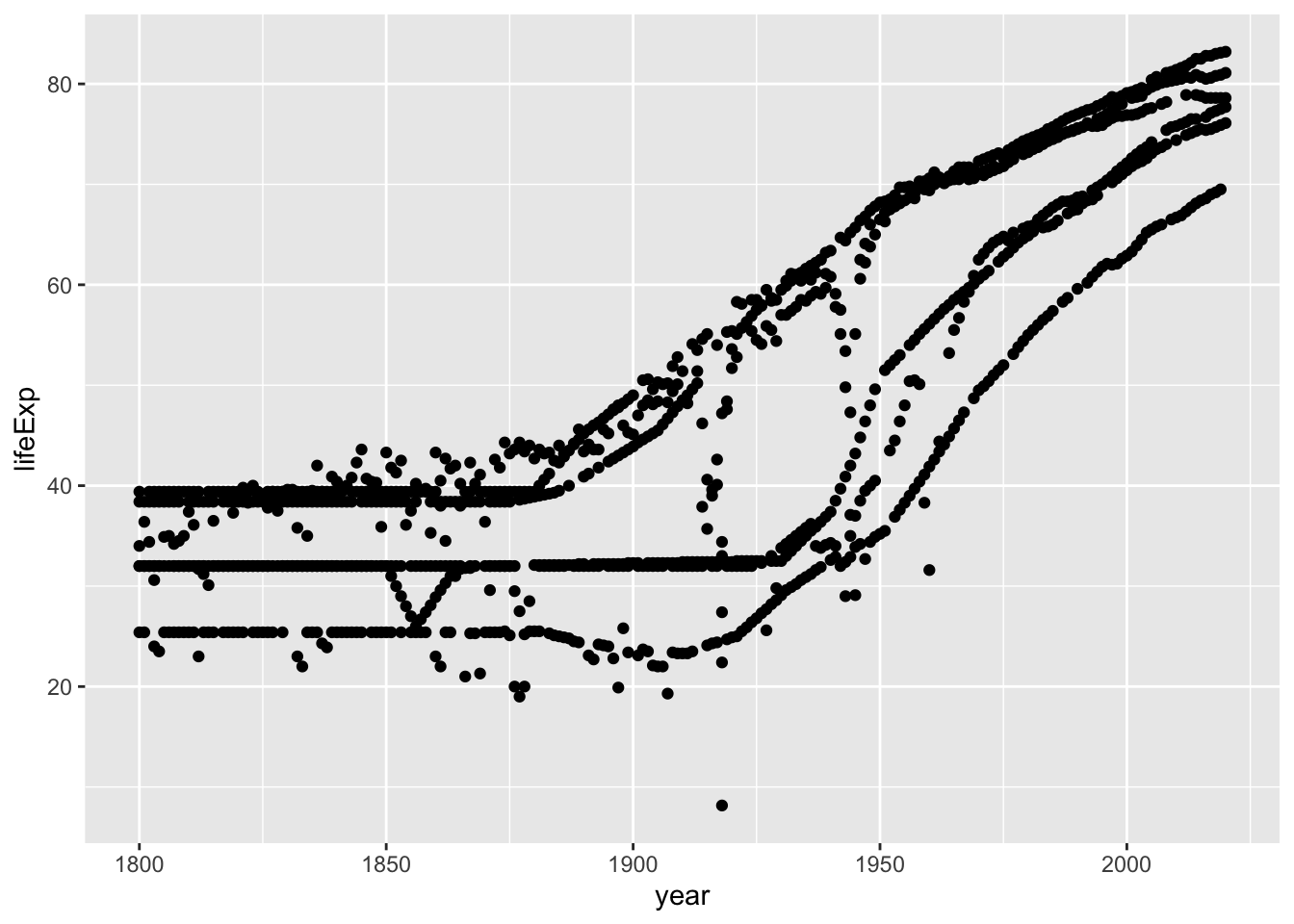
starting from the following basic code

countries_sel <- c("France", "Germany", "United States","China", "India", "Brazil")

gap_select <- gap_miss %>% filter(country %in% countries_sel)

ggplot(gap_select, aes(x = year, y = lifeExp)) +
  geom_point(na.rm = TRUE)

see if you can perform the following tasks.

You can look for inspiration at this section of the R graph gallery.

Challenge

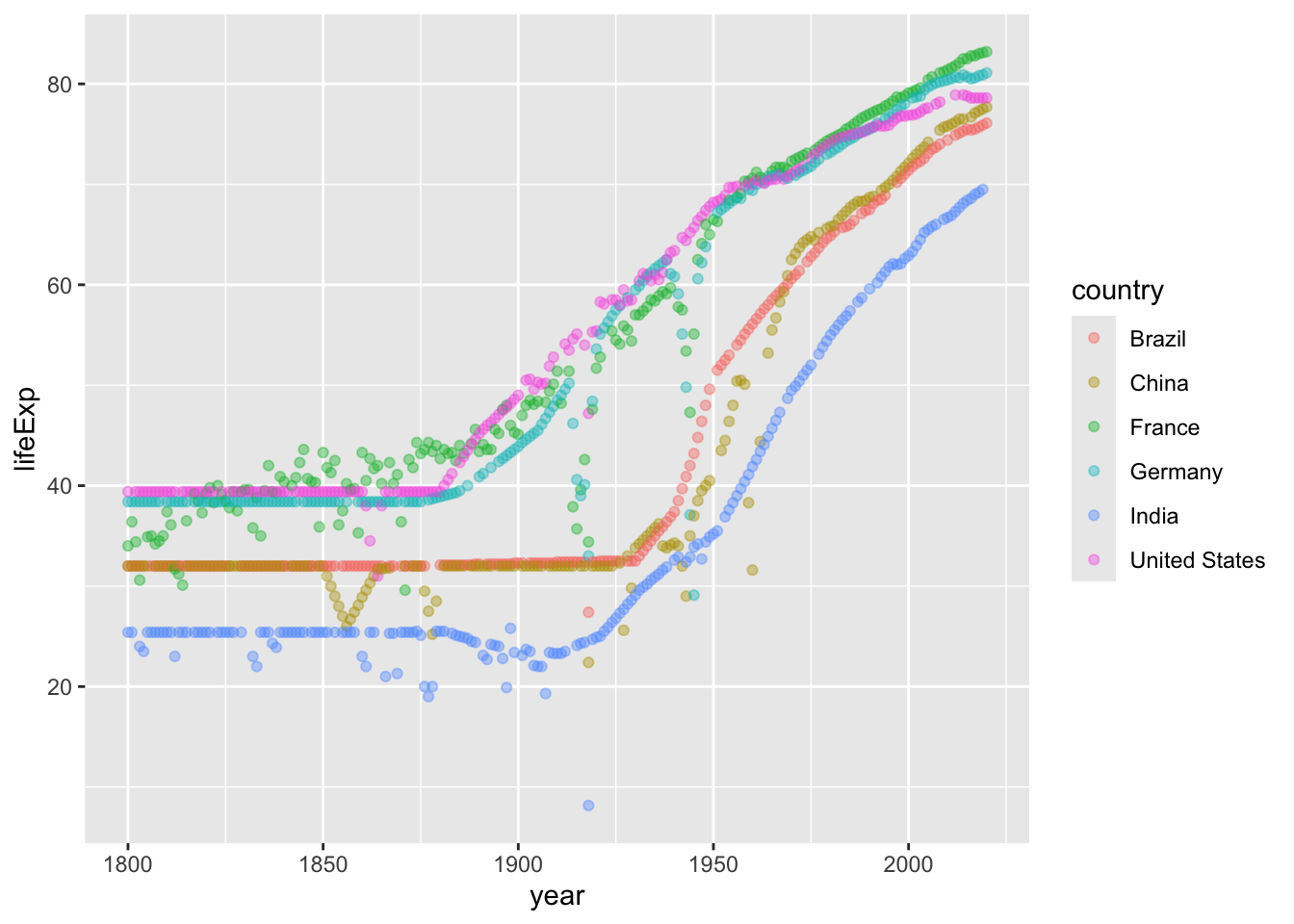
  1. Modify the code so that different countries are shown in different colors. Make points slightly transparent to reduce overplotting.
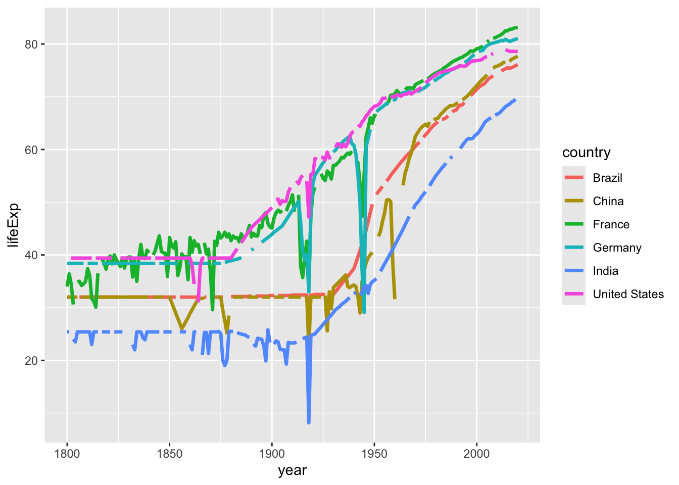
  2. Instead of a scatterplot, try to change the geometry in order to make a linechart Try to see if you can make the line thicker.
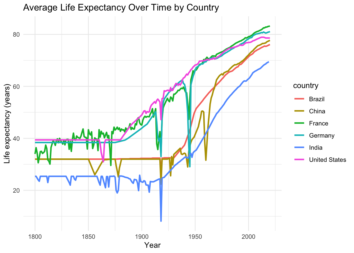
  3. Improve the plot by giving it a clear title and axis labels, using a cleaner theme and making the y-axis easier to read.
Click for (a possible) solution
ggplot(gap_select, aes(x = year, y = lifeExp, color = country)) +
  geom_point(alpha = 0.4, na.rm = TRUE)

ggplot(gap_select, aes(x = year, y = lifeExp, color = country)) +
  geom_line(linewidth = 1.2,na.rm = TRUE)

ggplot(gap_select, aes(x = year, y = lifeExp, color = country)) +
  stat_summary(fun = mean, geom = "line", linewidth = 1, na.rm = TRUE) +
  labs(
    title = "Average Life Expectancy Over Time by Country",
    x = "Year",
    y = "Life expectancy (years)"
  ) +
  theme_minimal()

One dimensional exploration

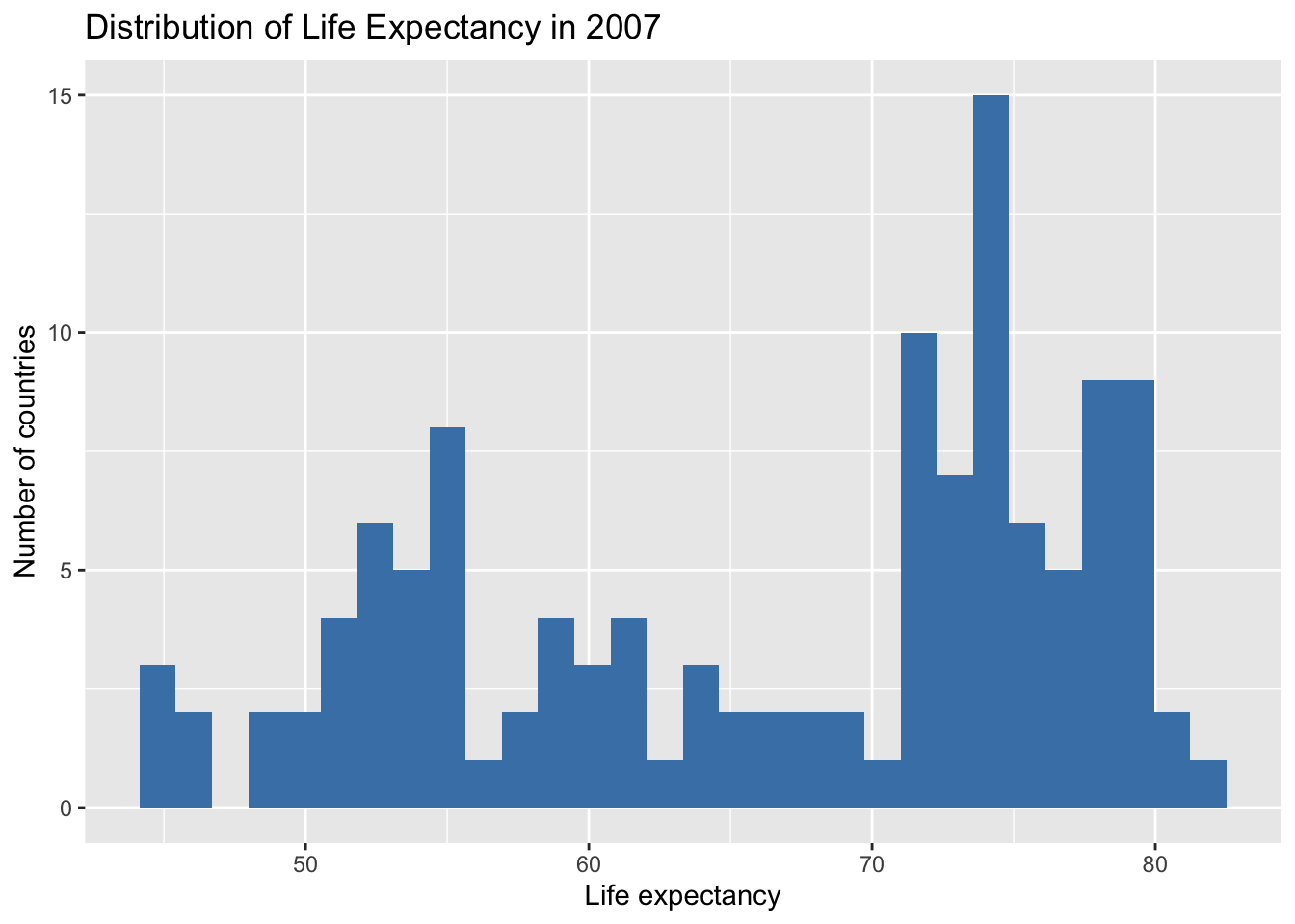
Now that we made some practice, let’s look at the distribution of life expectancy: as this is dependent on time, we need to explore this in a fixed year if we want to do it meaningfully!

ggplot(gap_2000, aes(lifeExp)) +
  geom_histogram(bins = 30, fill = "steelblue", na.rm = TRUE) +
  labs(
    title = "Distribution of Life Expectancy in 2007",
    x = "Life expectancy",
    y = "Number of countries"
  )

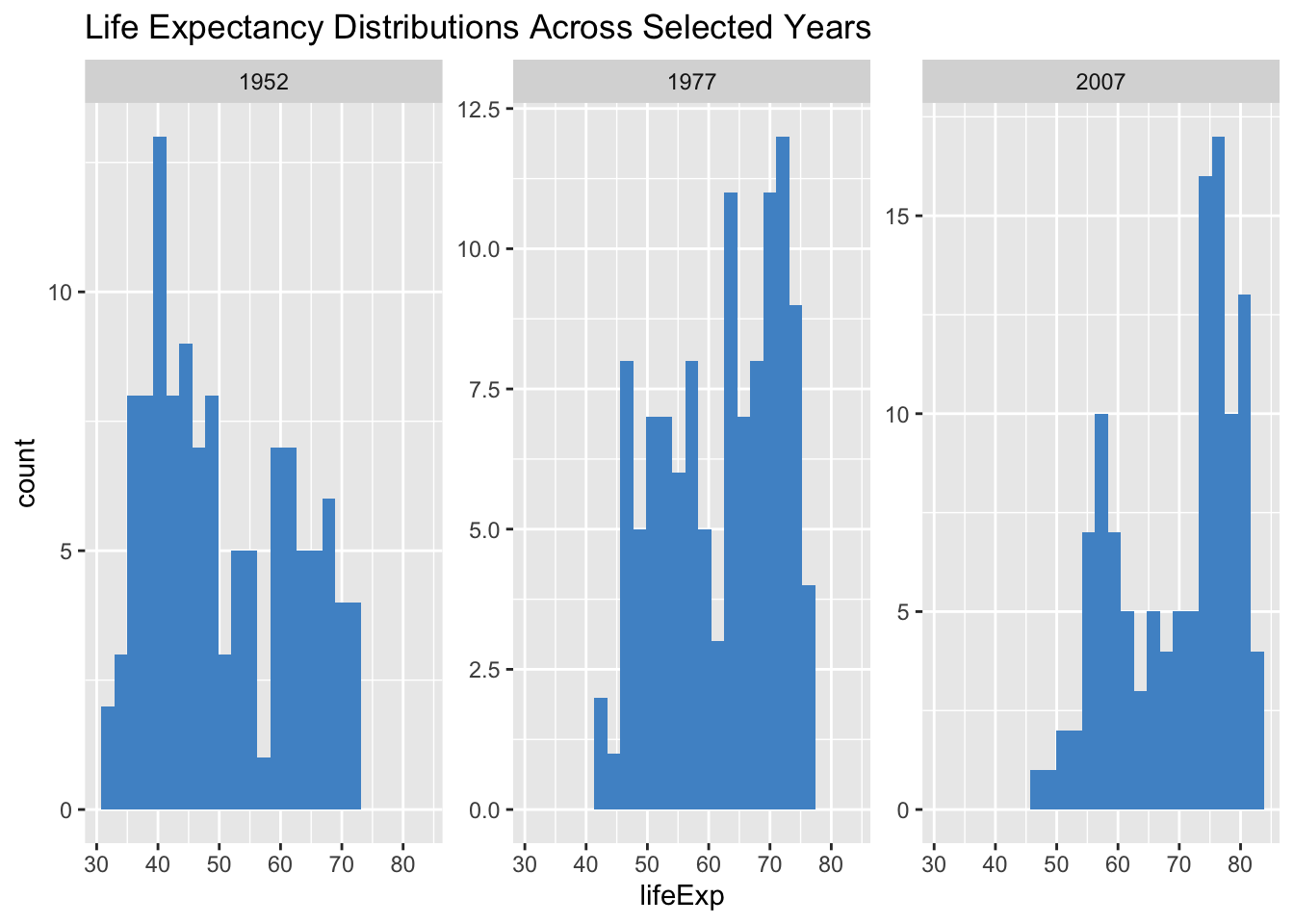
We can also explore this distribution across several years, using the methods we already know for plotting subgroups

years_sel <- c(1952, 1977, 2007)

gap_sel <- gap_miss |> filter(year %in% years_sel)

ggplot(gap_sel, aes(lifeExp)) +
  geom_histogram(bins = 25, fill='steelblue3' ,na.rm = TRUE) +
  facet_wrap(~ year, scales = "free_y") +
  labs(title = "Life Expectancy Distributions Across Selected Years")

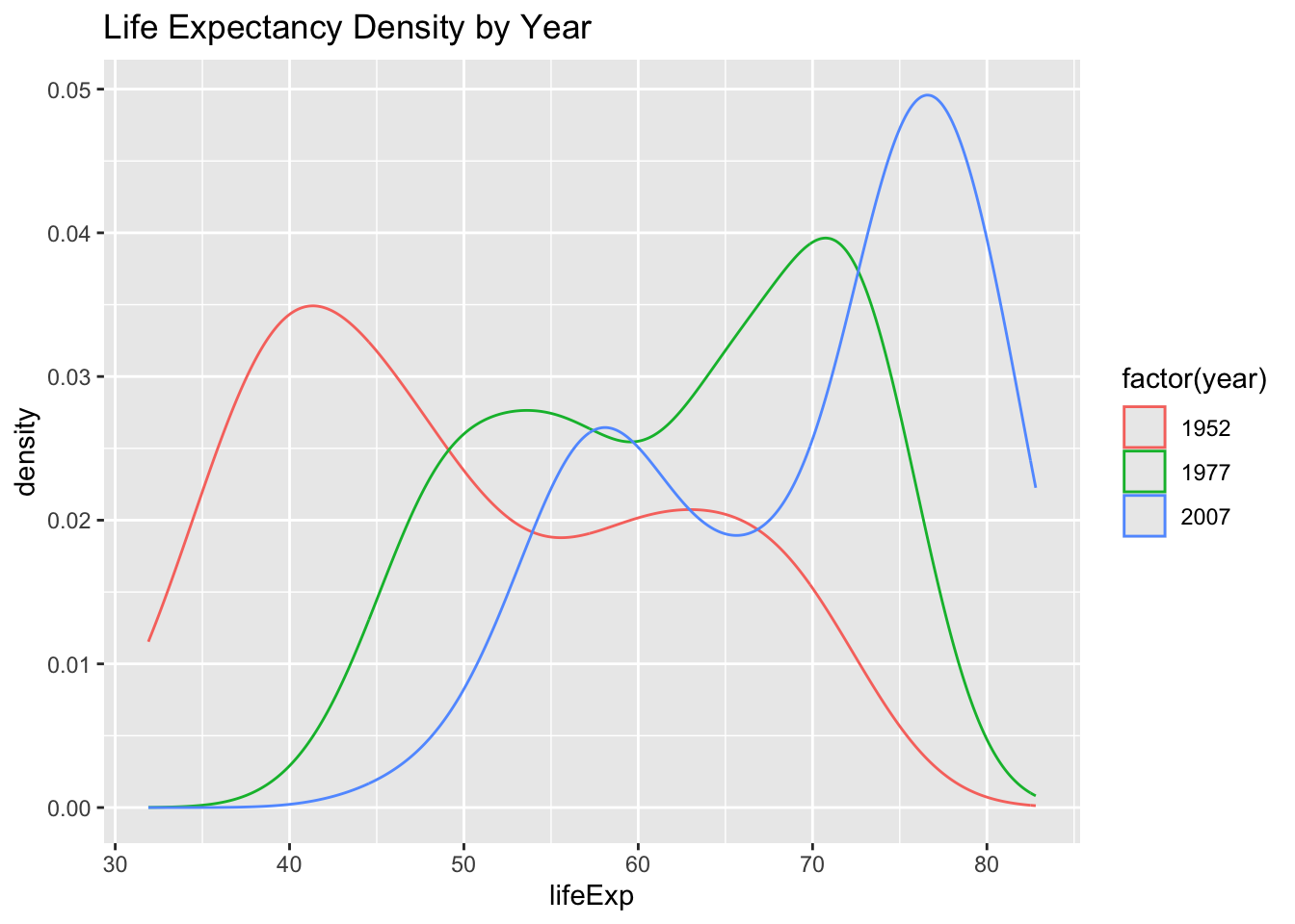
and we can strenghten exploration of the evolution of life expectancy by using density plots

ggplot(gap_sel, aes(lifeExp, color = factor(year))) +
  geom_density(na.rm = TRUE) +
  labs(title = "Life Expectancy Density by Year")

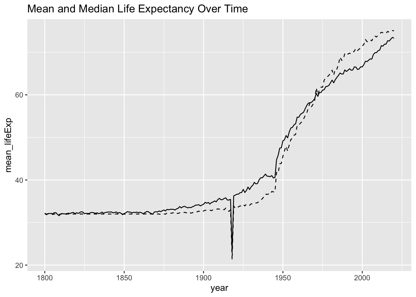
To plot the above, we just picked three years at random. We might explore this more in depth by plotting some statistics over time. Here’s how you plot the time series of mean and median life expectancy

gap_miss |>
  group_by(year) |>
  summarise(
    mean_lifeExp = mean(lifeExp, na.rm = TRUE),
    median_lifeExp = median(lifeExp, na.rm = TRUE)
  ) |>
  ggplot(aes(year, mean_lifeExp)) +
  geom_line() +
  geom_line(aes(y = median_lifeExp), linetype = "dashed") +
  labs(title = "Mean and Median Life Expectancy Over Time")

If we had more time, we would explore all the variables like this. Then, we would proceed to explore relationship and association between variables, remembering that we are in the special case of a time series (which will require us to decompose the time series to meaningfully address association).

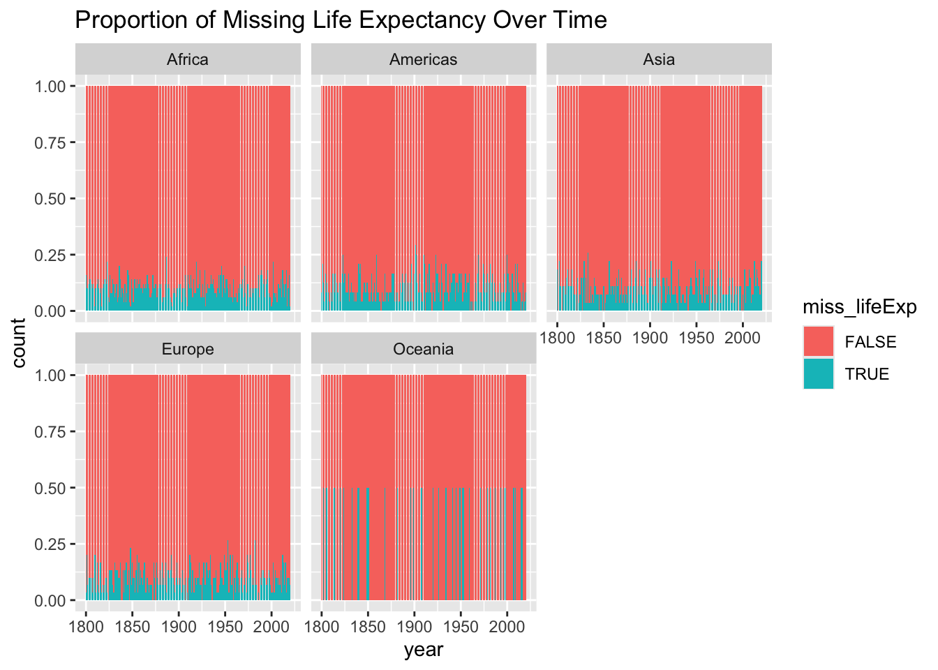
However, let’s use the rest of our time to focus on missingness. We know some standard plots to explore missingness. The tidyverse allows us to produce some nice variations with minimal code

gap_miss |>
  mutate(miss_lifeExp = is.na(lifeExp)) |>
  ggplot(aes(year, fill = miss_lifeExp)) +
  geom_bar(position = "fill") +
  facet_wrap(~ continent) +
  labs(title = "Proportion of Missing Life Expectancy Over Time")

Challenge

  1. Impute missing values using a time-series appropriated method
  2. Visualise the time series of mean life expectancy with imputed data
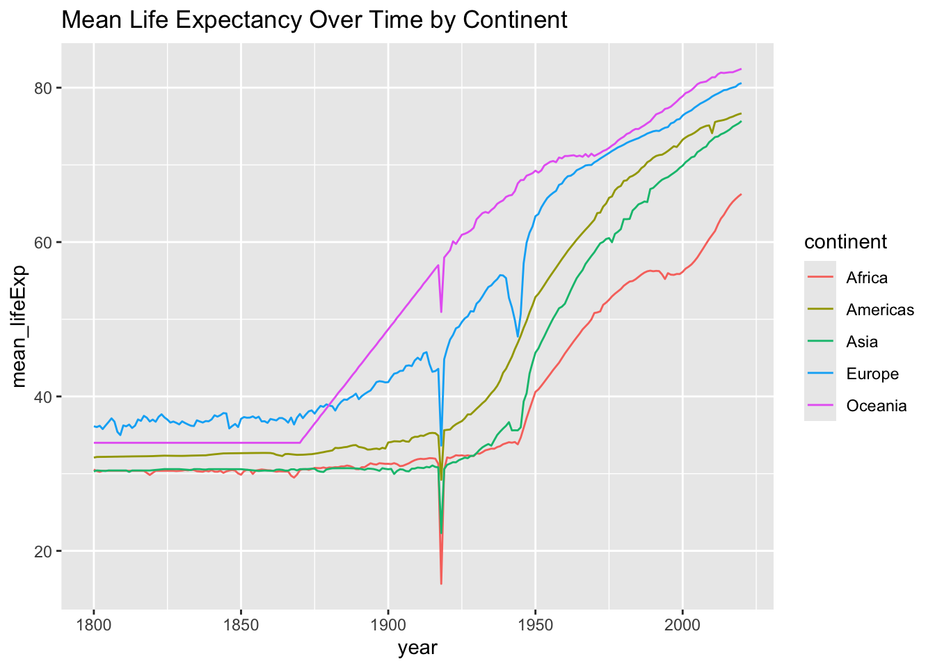
  3. Repeat the visualisation of point 2, but this time showing the separate time series of means (or medians) for each continent, using different colours

Part 1 is clearly the hardest, especially if you can’t use the zoo library (NCC doesn’t have it by default), so I’ll include code for a possible method.

interp_linear <- function(x, y) {
  approx(x, y, xout = x)$y
}

gap_imp <- gap_miss %>%
  arrange(country, year) %>%
  group_by(country) %>%
  mutate(lifeExp_imp = interp_linear(year, lifeExp)) %>%
  ungroup()

Can you see what the code is doing?

Click for solution
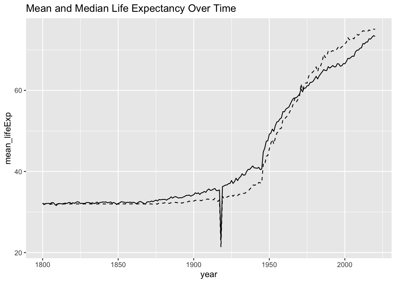
gap_imp |>
  group_by(year) |>
  summarise(
    mean_lifeExp = mean(lifeExp, na.rm = TRUE),
    median_lifeExp = median(lifeExp, na.rm = TRUE)
  ) |>
  ggplot(aes(year, mean_lifeExp)) +
  geom_line() +
  geom_line(aes(y = median_lifeExp), linetype = "dashed") +
  labs(title = "Mean and Median Life Expectancy Over Time")

gap_imp |>
  group_by(year, continent) |>
  summarise(
    mean_lifeExp = mean(lifeExp_imp, na.rm = TRUE),
    .groups = "drop"
  ) |>
  ggplot(aes(year, mean_lifeExp, color = continent)) +
  geom_line() +
  labs(title = "Mean Life Expectancy Over Time by Continent")