The main two types of statistical learning are: * Supervised learning, which is “learning with a teacher”: the student present an estimate response for each observation, the teacher provides the correct answer and the student improves their models. * Unsupervised learning, which is “learning without a teacher”. In this respect, it is more challenging (no training, no validation, no simple goal). But sometimes you can’t avoid using it!
Unsupervised learning is often overlooked, but it has many applications: recommender systems, document search, fake image analysis, risk management, …
Dimensionality Reduction
Dimensionality reduction methods aim to reduce the number of variables, retaining much of the properties of the original data. They are used to * Improve storage and computational complexity * Prevent overfitting in data analysis * Reduce noise and detecting anomalies The most important technique for dimensionality reduction is principal component analysis (PCA).
PCA using princomp()
Now that we are backed by the theory, let’s explore once again how to perform PCA with R. We will analyze the US Senate data sets, reduce its dimension in an appropriate way and see what this analysis tells us about the evolution of political parties in the US.
Us Senate data
You can download the data sets from Blackboard as .csv files in the folder USsenate.
We first start by loading the datasets in our environment together with the libraries.
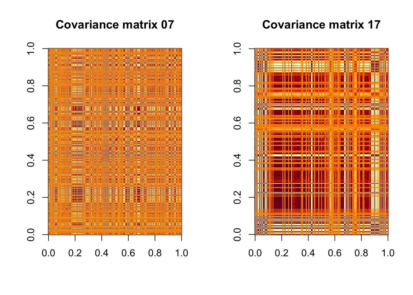
First of all, note that you can’t check the correlation matrix from a plot matrix, as it is just too big! We can try to visualize the matrix with a color plot:
Sigma07 <-cov(data07N)Sigma17 <-cov(data17N)par(mfrow=c(1, 2))image(t(Sigma07), main ="Covariance matrix 07")image(t(Sigma17), main ="Covariance matrix 17")
There is at least some redundancy in the data, which makes it worthwhile to try PCA. In the second plot this is more evident, so we might guess that PCA will be even more effective there.
/ Let us get the principal components using prcomp(). There is an argument to be made in favor of not to scaling the data: high variance in an observation means a higher level of disagreement in senators votes, while low variance means that most of them voted in the same way. If we care more about those issues that are more debated (e.g. gun laws) and less about those on which everyone agrees (e.g. raising senators’ salary) then it is preferable not to scale the data.
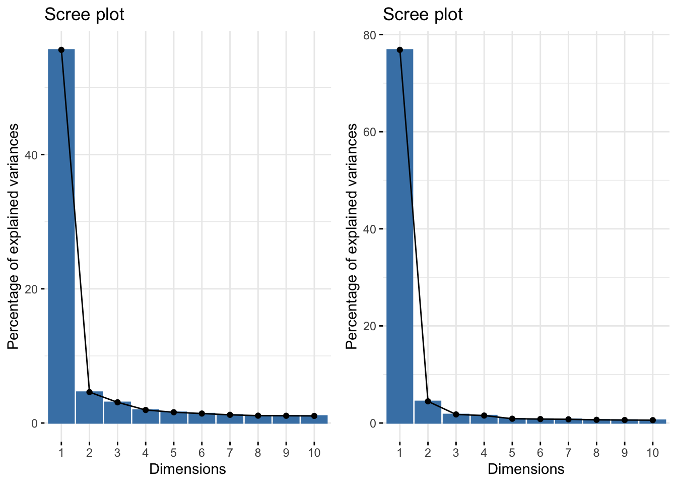
In the first case, one needs 19 principal components to capture \(\geq 80\%\) of variance, in the second case, it is sufficient to retain two of them! This is particularly striking, as our original set of variables contains more than 250 items! In both cases, \(PC1\) captures a lot of variance, so it is something interesting to look at.
To convince ourselves of this, we can make a screeplot
require(gridExtra)
Loading required package: gridExtra
Attaching package: 'gridExtra'
The following object is masked from 'package:dplyr':

    combine
Note that, even in the first case, there is a big discrepancy between PC1 and the other principal components. In this case one can make an exception to the “80% rule” by noticing two things:
Original variables are a lot.
There is a clear elbow in the screeplot: this is the point where the edges begin to flatten, and it occurs right after PC1.
According to this elbow method, we can make an argument for retaining only the first principal component.
Even when only one principal component is deemed to be sufficient, it is worthwhile to visualize scores on a biplot, that can be slightly squeezed on the horizontal axis, if needed.
The first principal component is a very good representation of party affiliation! From the historic comparison of the two plots, we can see that the divide between Democrats and Republicans has grown a lot between 2007 and 2017, this is an indication that polarization of senators along party lines is a phenomenon that predates the election of Donald Trump (2016).